In this tutorial, I will show you how to make a table in Google Sheets.
Working with Google Sheets may make it seem like you have your data in tabulated format. But since everything within your spreadsheets appear tabulated, do you really have tables?
In reality, there is no option to insert a table in Google Sheets unlike in Docs, but an option to make a table in Google Sheets does exist.
Make a Table in Google Sheets
- Prepare your data with header rows
- Select your whole dataset
- Go to Format
- Select Alternating colors
- If needed, modify the design via the window that opens

3 Ways to Make a Table in Google Sheets
Not having an “Insert Table” button to make a table in Google Sheets doesn’t mean there is no way to put a table in Google Sheets.
Below are at least 3 ways to make a table in Google Sheets that I have listed for your reference.
1. Applying Alternating Colors in Google Sheets
A table in Google Sheets is often used for visualization or presentation functionalities.
With that in mind, the top method in making a table in Google Sheets for me will be to use the Alternating Colors format option.
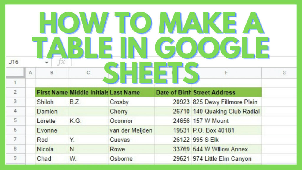
To do this, you have to have a dataset that will be turned into a table. It’s highly suggested to have a header row that contains the column titles for each subset of your data.
Next, I just need to select the whole data range.

Then go to the ‘Format’ menu and select the ‘Alternating colors’ option.

This will automatically apply the default style to your dataset turning it into a table and at the same time, showing the ‘Alternating colors’ window to the right.
You can edit the appearance of your newly made table in this window.

To show you how it’s done, I’ve clicked on one of the other default styles, and in turn, my table instantly changed its color scheme.

To make the table look better, I selected all the columns where the table is in with the intention of adjusting the columns’ sizes.

This can be done by using the ‘Resize columns’ option, similar to resizing rows.
In the Resize columns window, I just have to turn on the radio button for the ‘Fit to data’ option and hit OK.

This automatically adjusts the width of each column to make sure that its content doesn’t bleed out of the cell.

These are the steps that I use here are some of my recommended ones to make a good table in Google Sheets. Of course, depending on your preference, you may do more formatting or omit some steps as well.
2. Using the Filter Tool in Google Sheets
The next method that I’ll be showing here is a simple and quick one.
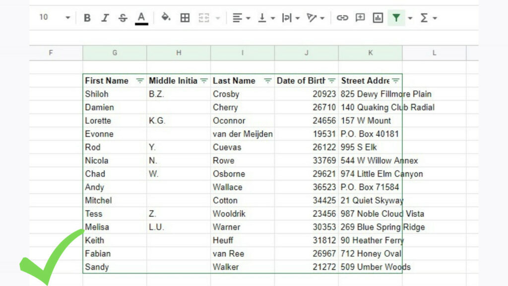
You can also create a table in Google Sheets by using the Filter tool.
To start, you simply have to select your dataset and click on the ‘Create a filter’ tool.

This will instantly create a functional table in Google Sheets for you with filter and sort options available by clicking on the reversed triangle button on each column header.
It’s highly recommended to have a header row for this method.
This is another quick way to create a table in Google Sheets but some formatting options that I recommend that you can do after this step is adjusting the column size to resized fit to data and using the Alternating colors format option.
3. Manual Table Creation in Google Sheets
The last method is by creating the table in Google Sheets manually.
This means that, unlike the previous two techniques, you cannot create a table instantly after activating one option.
To start, I just need to select my entire dataset and hit the ‘Borders’ tool.

Next, activate the Outer borders option. This will cause the entire dataset to have a border, technically turning it into a table, but at the same time not so much.
To make this into a more decent table in Google Sheets, I am going to add more borders and formatting.

Next, to distinguish the header row for my table, I selected the first row of my dataset containing each column’s title. Then I selected the Bottom border option of the ‘Borders’ tool.

This allowed my table to have a defined header row.
Next, I selected each column separately and applied the Outer borders option giving each column a defined border.

Now that I have a fairly decent table, I need to make it easier to look at by making some changes to its appearance.
Selecting the header row again, this time I am activating the ‘Bold’ tool.

With the column titles in bold font, it’s easier to read what each column contains.
The next step is to adjust the size of the columns so that no cells will bleed out of its cell.
This can be done by selecting all columns that the table is in and right-clicking on any of the column headers.
In the context menu that opens up, click on ‘Resize columns’.

On the Resize columns window, I just need to activate ‘Fit to data’ and then hit OK.

This automatically adjusts the size of each column to fit the data in it.

The last thing that I can recommend when creating a table in Google Sheets, is to use the Alternating colors format option.
To do this, I have to re-select the entire table and go to the ‘Format’ menu, and select ‘Alternating colors’.

This will automatically apply a default style to my table and open the Alternating colors window.
In the Alternating colors window, I created a new custom style and applied it to my table.

And now, my manually made table is complete.

Other than using a table in Google Sheets, there are also other ways to visualize data such as using a Pie Chart or a Bar Graph. And of course, other ways to format how your data will look like in the end.
Frequently Asked Questions about How to Make a Table in Google Sheets
How can I make a table in Google Sheets?
To make a table in Google Sheets, select your dataset and then go to the Format menu and select alternating colors. Alternatively, you can also make a table in Google Sheets by selecting your dataset and then using the Filter tool, or by manually creating it using the Borders tool.
Can I use functions and formulas within a table in Google Sheets?
You can certainly use functions and formulas within a table in Google Sheets and you may even use formulas that auto-populate the contents of your table. You can also use the contents of your table as the parameters of other functions outside the table you created.
Conclusion on How to Make a Table in Google Sheets
You can make a table in Google Sheets by first preparing your data with header rows. Then start with selecting your whole dataset. Next, go to Format and select Alternating colors. You now have a table at this point. If needed, modify the design via the window that appears on the right side of your screen.