In this tutorial, I am going to explain how to create sparklines Google Sheets, and how it allows you to insert varying types of charts into a lone cell.
Not all huge datasets in Google Sheets are compatible with large charts or graphs that can be used to visualize data.
In such a case, utilizing cell-bound charts with the SPARKLINE function may be the solution.
A SPARKLINE-made chart is a miniature chart contained in just one cell. It allows for a simpler and quicker way to visualize data in Google Sheets.
And even though a sparkline is a line chart by default, the SPARKLINE function gives you the capability to produce other chart types, including single-cell bar and column graphs.
How to Create Sparklines in Google Sheets
- Prepare the data that you want to translate into a chart
- Identify the range of the data to be used (data_range)
- Unless you want a line graph, identify the chart type that you wish to use (options)
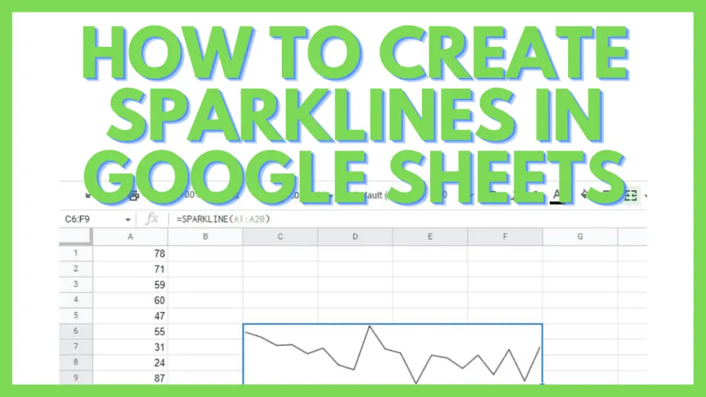
- Use the formula =SPARKLINE(data_range,{[options]})

Sparklines in Google Sheets Video Tutorial
4 Chart Types of Sparklines in Google Sheets
The formula of Sparklines in Google Sheets is:
=SPARKLINE(data_range,{[options]})
The most useful options parameter is “CHARTTYPE” which specifies among the 4 chart types of Sparklines in Google Sheets will your chart be.
Depending on your dataset, one type of sparkline may have an edge over the other.
1. Line Type Sparklines in Google Sheets
The widely used, default type of sparklines, the Line chart shows the ups and downs of data in relative comparison to each other.
The data is represented by the Line chart in order of how they appear in the dataset.

Line Sparkline Width
Option: {“linewidth”, integer}
This option gives the line charts a literal line thicker based on the value you have provided.

2. Bar Type Sparklines in Google Sheets
This sparkline creates a bar of percentile with its data representing their value vs the total value of the whole data set.

Bar Sparkline Max
Option: {“max”,value}
The “max” option gives you the ability to detail the highest possible value along the horizontal axis. With it, you can construct bar sparklines similar to the following screenshot:

Bar Sparkline Color
Color1 and Color 2 allow you to specify the color differentiation of the values in your bar sparkline.

=SPARKLINE(B4:C4,{“charttype”,”bar”;”max”,MAX(B4:C13);”color1″,”red”;”color2″,”blue”})
The bar sparkline gives a good visual aid for the difference between two or more data sets over a range of values.
3. Column Type Sparklines in Google Sheets
The Column sparkline needs the respective chart type and the data range, which needs to just be a single column or row.

Column Sparkline Axis
Options: {“axis”, true}
The axis option strikes a line by the middle of the data set, respective to the current position of the columns.

Column Sparkline Color
Option: {“axiscolor”,”color-name-or-code”}
The “axiscolor” option defines the axis with a color of your choosing. This helps to visually pinpoint the axis for the column sparkline.

Using the column sparkline gives us a better view of datasets with negative and positive values simultaneously.
4. Winloss Type Sparklines in Google Sheets
The Winloss type sparkline in Google Sheets is a unique one among the others as it doesn’t really visualize the quantity of the value but merely the quality as positive or negative.
It simply showcases a “win” or a “lose” as in “positive” or “negative”.

Winloss Sparkline Axis
Options: {“axis”, true}
The axis option strikes a line by the middle of the data set, respective to the current position of the Winloss columns.

Winloss Colors
Option: {“Color”,”pink”}

These are the more common options for Sparklines in Google Sheets. If you want to know more options, there are a lot more for all chart types.
Frequently Asked Questions about How to Create Sparklines in Google Sheets
Can you make a vertical bar sparkline in Google Sheets?
A vertical bar chart in Google Sheets is called a ‘Stacked Column Chart’. It can be put into your spreadsheet via the Chart Editor but not by the SPARKLINE function.
What are the options of the Line chart of function sparkline in Google Sheets?
For Line chart, the options are “xmin”, “xmax”, “ymin”, “ymax”, “color”, “empty”, “zero” or “ignore”, “nan”, “rtl”, and “linewidth”. As for the range, you can assign up to a maximum of two rows or two columns.
Conclusion on How to Create Sparklines in Google Sheets
To create sparklines in Google Sheets, prepare the data that you want to translate into a chart and identify the range of the data to be used (data_range). Now unless you want a line graph, identify the chart type that you wish to use (options). Lastly, use the formula “=SPARKLINE(data_range,{[options]})”.