Google Sheets can be used to process and visually present your data.
One commonly used chart type is the Pie Chart. I’ve been using this for so many years now to present different forms of data and even for dashboards.
This visualization tool showcases part-to-whole relationships in data and makes the data easy to grasp for the viewer.
But unlike other tools and functions such as sparklines, Pie Charts are highly customizable.
In this tutorial, I’m going to show you how to make a Pie Chart in Google Sheets.
How to Make a Pie Chart in Google Sheets
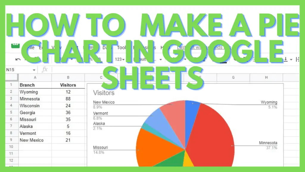
- Select the range containing the data for the pie chart
- Go to the ‘Insert’ menu, and select ‘Chart’
- The pie chart will show up, if you want to edit it, you can do so in the ‘Chart editor’ window
Pie Chart in Google Sheets Video Tutorial
A Step-By-Step Tutorial to Create a Pie Chart in Google Sheets
Pie charts are most useful if you want to compare parts of a dataset to the whole dataset.
You can show the percentages of each part of the dataset versus its total.
To start, you must have a small dataset preferably a small representation with labels in one column and the numbers in the other.
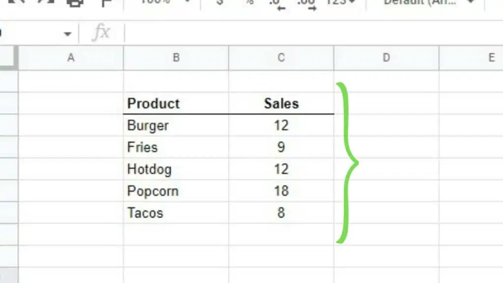
Step 1 – Create the data set and select the range for the pie chart in Google Sheets
As an example, I created a small Product-Sales dataset that displays the name of the products in one column and the number of sold items in the other column.
Let me now explain how to create a Pie chart in Google Sheets.
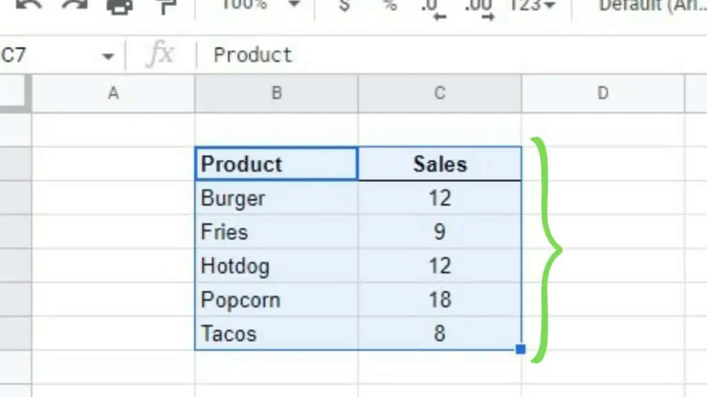
Once you have the dataset ready, select the whole range containing everything from its headers up to the last value that you wish to include in your pie chart in Google Sheets.
Step 2 – Go to the ‘Insert’ menu, and select ‘Chart’
Go to the ‘Insert’ menu and select ‘Chart’.
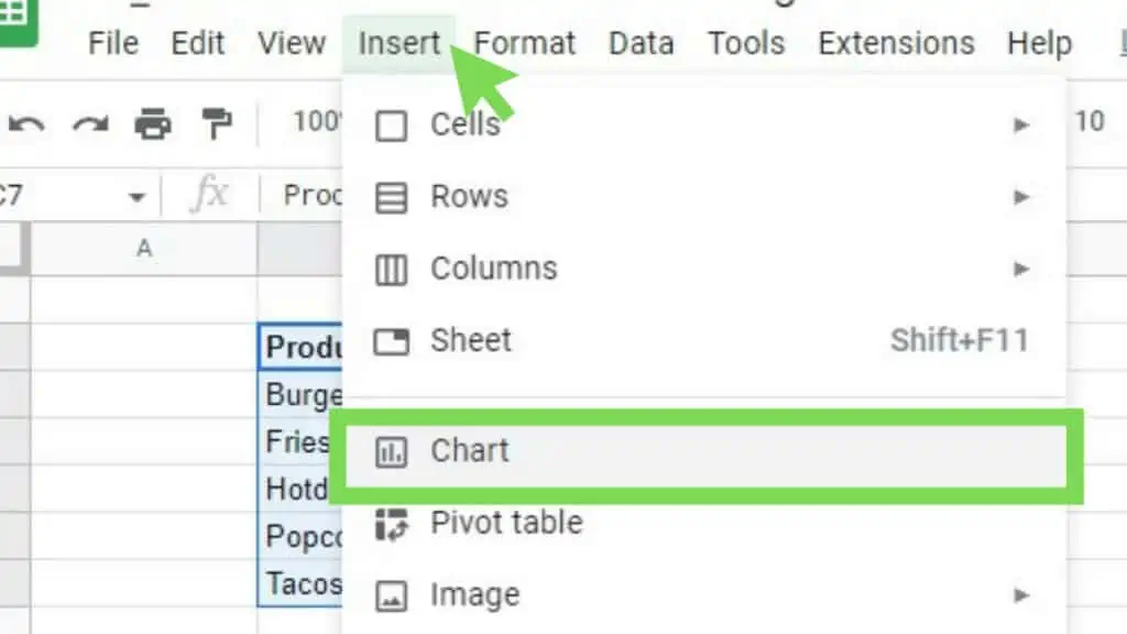
As a default, a basic pie chart representing your data will instantly populate.
Step 3 – Edit the pie chart using the ‘Chart editor’ window
The ‘Chart editor’ will also appear giving you the ability to edit and customize your pie chart in Google Sheets.
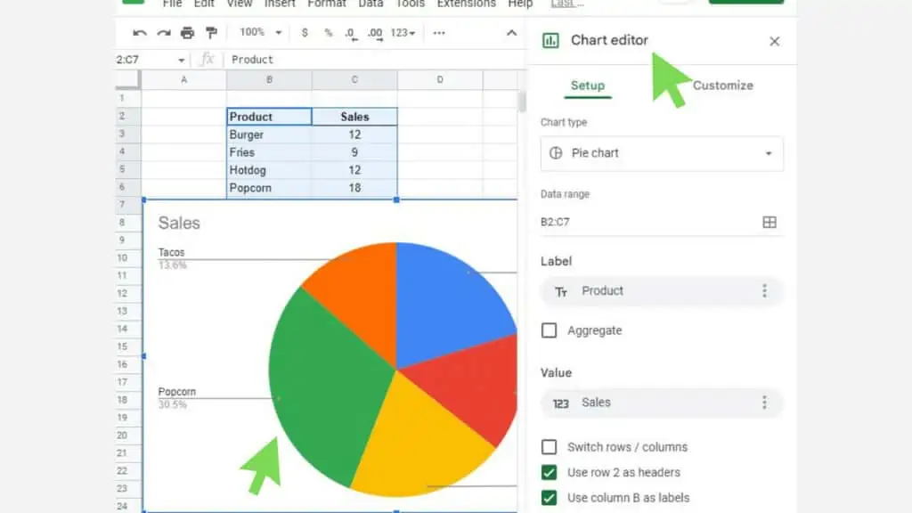
All the settings here are the default ones set by Google Sheets.
Using the ‘Chart editor’, I can customize the pie chart to how I want it to look.
There are different options to customize:
- Chart style
- Pie chart
- Pie slice
- Chart & axis titles
- Legend

Three Types of Pie Charts in Google Sheets
If you don’t want to take a look at manually customizing your pie chart, you can also use the three options readily available in the ‘Chart editor’.
Go to the ‘Setup’ tab and click on the ‘Chart type’ field. There you can see different chart types by scrolling down.
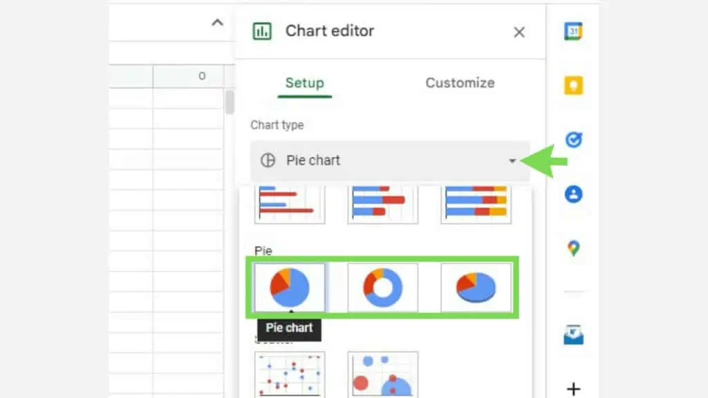
Once selected, your choice of the pie chart will instantly reflect on the actual chart displayed in your sheet.
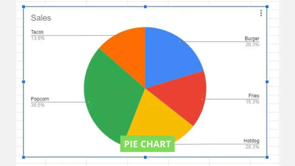
Pie Chart
The default option for pie charts is a solid 2D block reflecting each value per label in a different color.
The size of each value is a direct reflection of its cut out of the total percentage for the whole dataset.
Doughnut Chart
The only difference of this pie chart is under the ‘Pie chart’ edit options, where ‘Donut hole’ will be set to 50%.
Other than that, everything else by default is the same as the default pie chart.
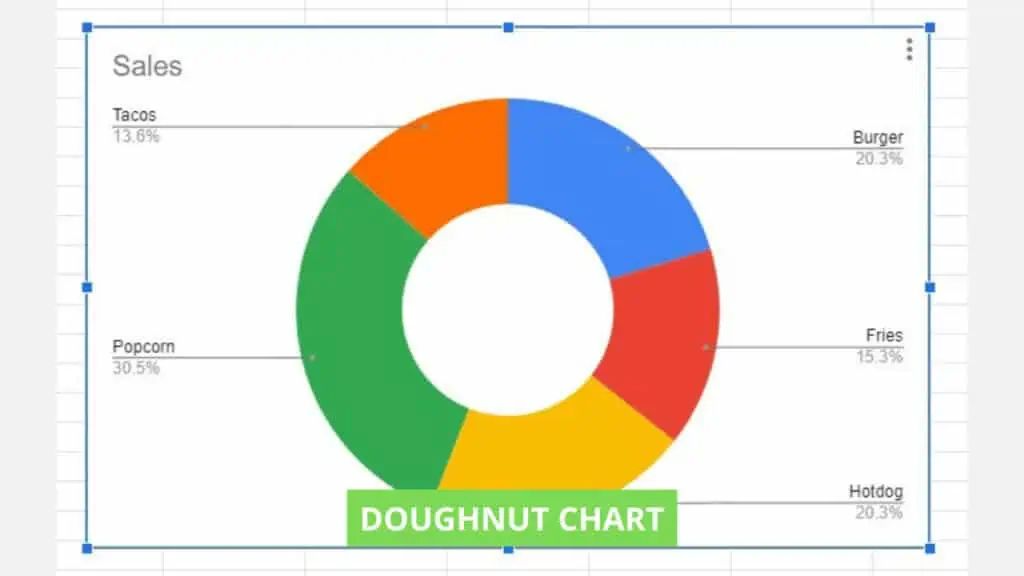
Other than selecting the doughnut chart in the ‘Setup’ tab of the ‘Chart editor’ window, you can also create a doughnut chart from any regular pie chart by changing the ‘Doughnut hole’ property to anything other than 0%.
3D Pie Chart
There are just two differences in the 3D Pie Chart in Google Sheets when compared to the default pie chart.
The 2 differences are:
- Under ‘Chart style’, the 3D option is ticked.
- And in doing so, this disables the Border color option in the ‘Pie chart’ edit options making it unusable and grayed out.
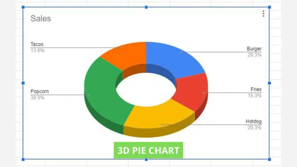
The 3D Pie Chart can also be made from a regular pie chart by adjusting the customizable default options.
Customized Pie Chart
Knowing how to make a pie chart in Google Sheets with the regular, doughnut, and 3D premade options, I customized one that has all the characteristics mentioned above.
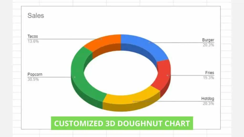
Depending on what type of data you need to visually present and your preferences, you can manipulate how your pie chart in Google Sheets looks like.
Frequently Asked Questions about How to Make a Pie Chart in Google Sheets
How do you make a pie chart in Google Sheets?
To make a pie chart in Google Sheets, click on the Insert menu and then select Chart from the dropdown list that appears. You must have a range with your data selected otherwise a window with the message ‘No data’ will show up.
How can I make a dynamic pie chart in Google Sheets?
To make a dynamic pie chart in Google Sheets, you can have functions in your dataset table instead of plain numerical values. This way, anytime a value from the data range of your pie chart changes, the representation on your pie chart gets updated as well.
Conclusion on How to Make a Pie Chart in Google Sheets
To make a pie chart in Google Sheets select the range containing the data for the pie chart and then going to the ‘Insert’ menu, and selecting ‘Chart’. The pie chart will show up and if you want to edit it, you can do so in the ‘Chart editor’ window.