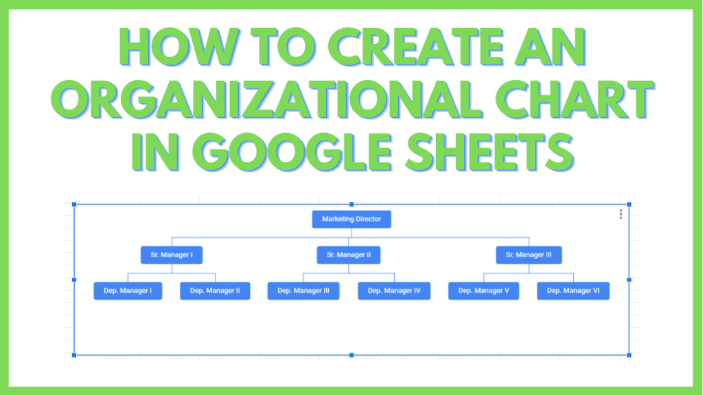
In this tutorial, I will teach you how to create an Organizational Chart in Google Sheets.
Organizational Charts are visualization tools that represent how entries in a table relate to each other in a hierarchical manner.
In addition to this, an Organizational Chart also allows you to add a tooltip to each element in your chart. This provides additional information on the element that you can access by hovering your mouse pointer over it.
I will also teach you how to set up a table for your own Organizational Chart, and how to manipulate the entries on your table to show additional information on the chart.
Finally, I will teach you how to customize your Organizational Chart. So that in the future, you can create your own Organizational Chart through the use of functions like TRANSPOSE or CONCATENATE.
How to create an Organizational Chart in Google Sheets
Steps on how to create an Organizational Chart in Google Sheets:
- Select the table to use for your Organizational chart
- Insert a Chart by clicking “Insert” from the menu bar, then by clicking “Chart”
- Enter the “Chart editor” panel by clicking the kebab and “Edit chart” buttons, then select “Organizational chart” from the Chart type drop-down
- Customize the Organizational Chart’s Size, Node color, and Selected node color through the Chart editor’s customize tab
- Customize the Organizational Chart by changing the values in the source table
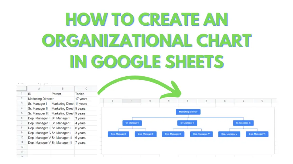
The Organizational chart reference range structure explained
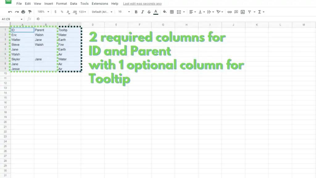
An Organizational chart needs to refer to a table that has 2 required columns, and one optional column. We refer to the required columns as the ID and Parent columns, and the optional column as the Tooltip column.
ID column: Column that contains the main text that will appear for the element in an organizational chart.
Parent column: Column that contains hierarchical information on which other ID the current ID will be under in an organizational chart.
Tooltip column: Column that contains what tooltip will appear when an element is hovered over by the mouse pointer in an organizational chart.
Creating an Organizational Chart in Google Sheets Step by Step
Step 1 – Select the table to use for your Organizational chart
To create an Organizational Chart in Google Sheets, you first need to select a table. Keep in mind, though, that there are certain requirements for the table to work as a source for an Organizational Chart.
The first requirement is that the table has to have 2 or 3 columns.
One of the columns will be used as the ID, or the text shown for an element in the chart, the other will be used as the Parent, or the level above the ID in the chart, and the last one will be used as the Tooltip, or the value is shown when you hover over the element.
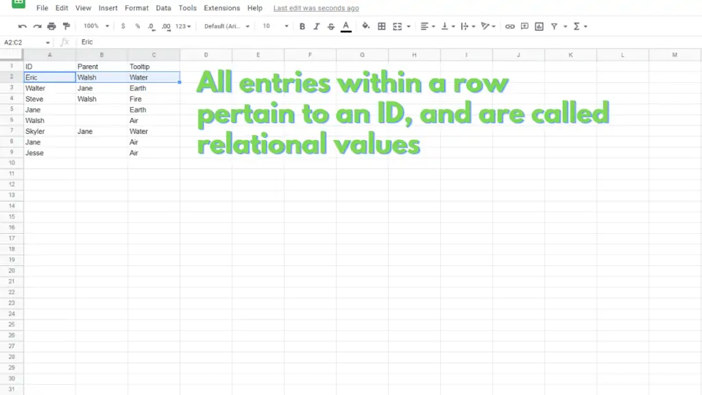
Second, each row in this table must pertain to an individual element.
Assuming that the IDs are in column A, the Parents are in column B, and the Tooltips are in column C, the Parent and the Tooltip in row 3 must pertain to the ID in the same row.
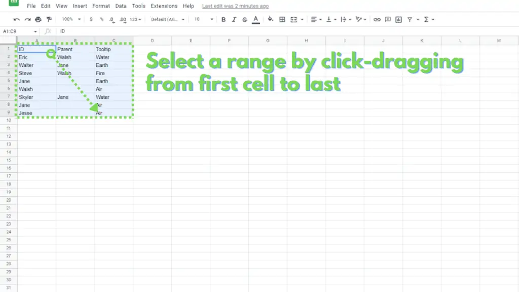
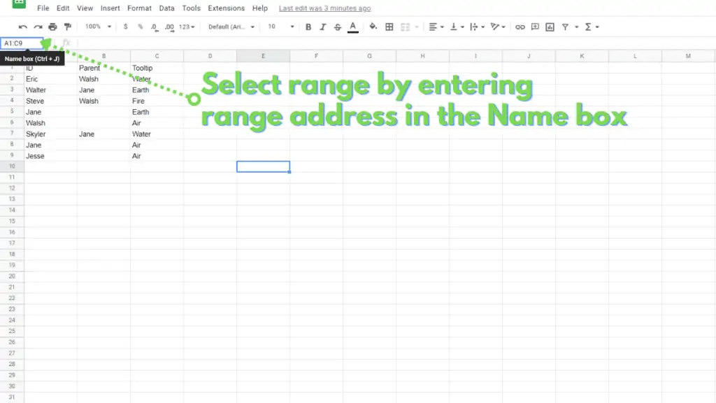
You can select the range by click-dragging from its first value (top-left) to its last value (bottom-right).
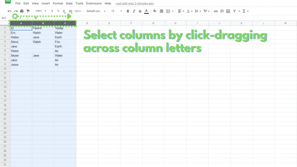
You can also select the columns by clicking on their column letters.
And lastly, you can choose to type the address of the range on the name box to select it.
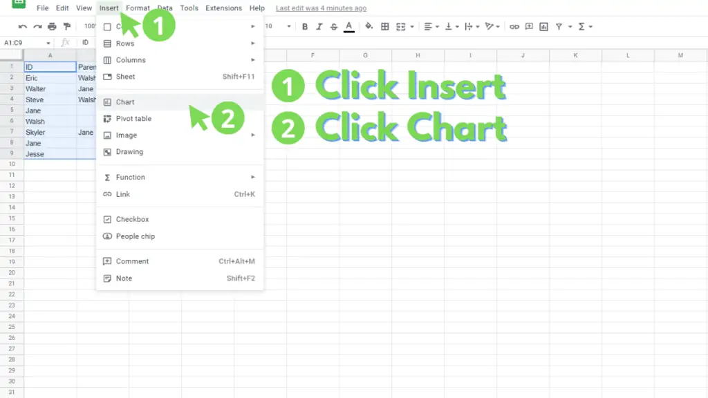
Step 2 – Insert a Chart by clicking “Insert” from the menu bar, then by clicking “Chart”
Once the table or range has been selected, click on “Insert” from the menu bar, then click “Chart”. This will create a default column chart using the data from the table or range.
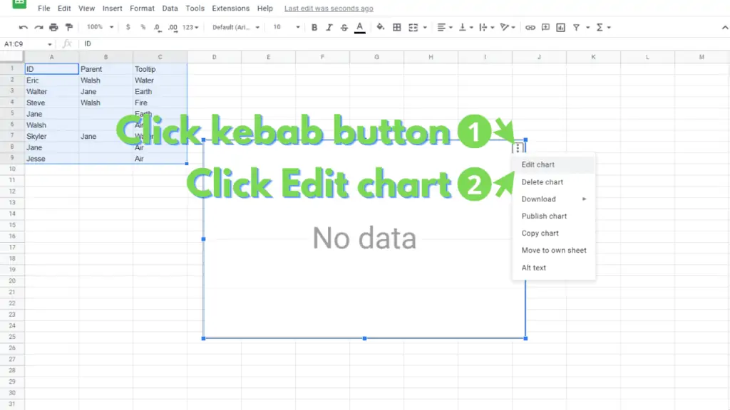
Step 3 – Enter the “Chart editor” panel by clicking the kebab and “Edit chart” buttons, then select “Organizational chart” from the “Chart type” drop-down
The next step is switching the default Column Chart that was created into an organizational chart.
To do this, select the chart, then click on the kebab button in the upper right corner. In the selection, click on “Edit chart”. This should open the “Chart editor” panel:
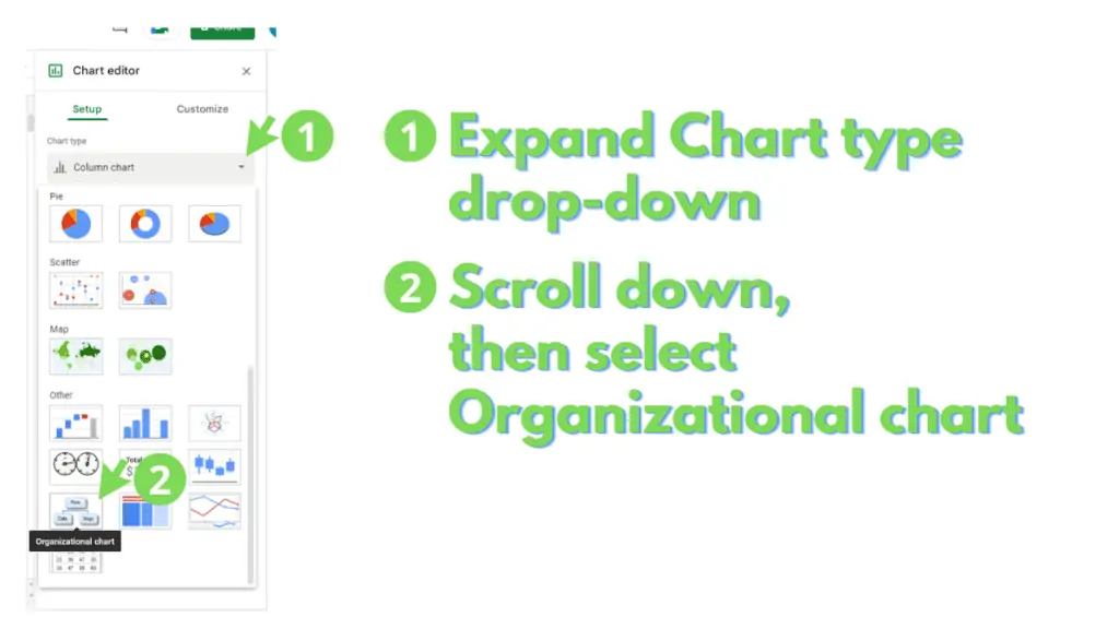
From the “Chart editor” panel, click on “Column chart” under the “Chart type” section. This will expand to show you the other types of charts that you can use.
Scroll down to the “Other” section and here, you can click on “Organizational chart”.
Finally, tick the “Use row 1 as headers” checkbox to exclude the first row of your table from being considered as an individual element from your “Organizational chart”.

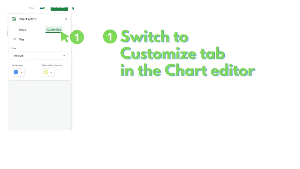
Step 4 – Customize the Organizational Chart’s Size, Node color, and Selected node color through the Chart editor’s customize tab
You can further customize your Organizational chart through the “Customize” tab of the “Chart editor” panel.
To access this section, simply open the chart editor, then switch to the “Customize tab”.
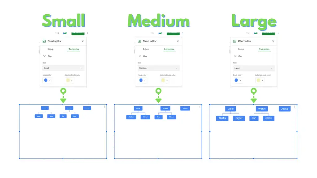
In this section, you can change the Organizational chart’s size between Small, Medium, and Large. This option pertains to the size of the box containing the elements, and the size of the text for them.
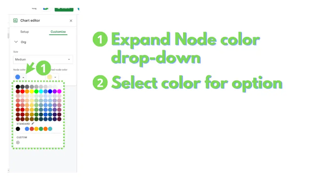
You can also change the Node color for all of the elements in your Organizational chart. The node color is the fill color for each element.
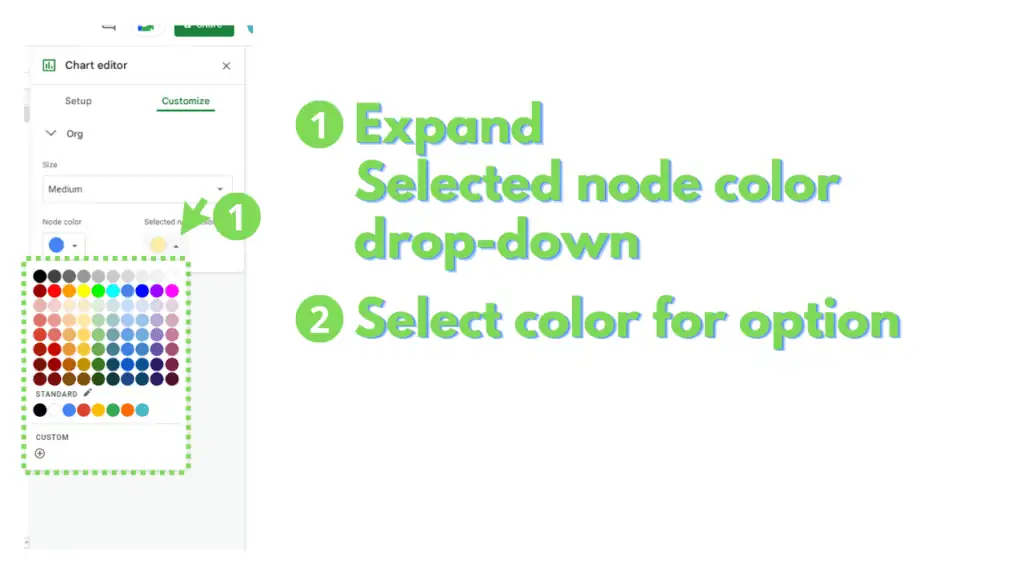
Finally, you can change the Selected node color for your Organizational chart. The Selected node color will fill a node when that node is selected.
Step 5 – Customize the Organizational Chart by changing the values in the source table
There are several alterations that you can do to the table or range that the Organizational chart references to manipulate the structure of the chart.
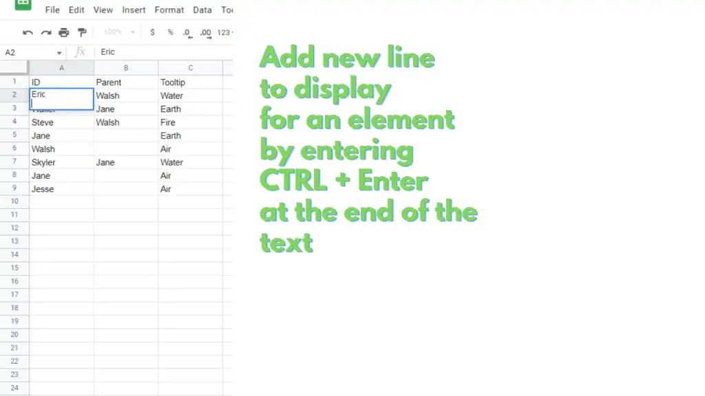
You can add more lines of text on an individual element, to display on the Organizational chart.
To do this, simply select the ID cell for the element, then move the typing cursor to the end of the text.
Once there, enter CTRL + Enter on your keyboard. This should create a new line for you to enter text on.
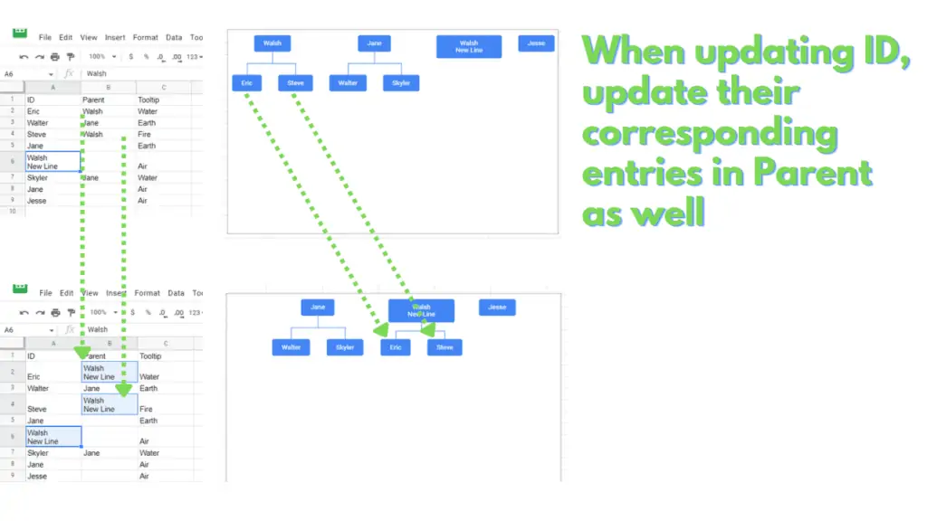
Keep in mind, though, that if the original ID serves as a parent of different IDs, you must also replicate the new text on the respective Parent cells of the other IDs.
Otherwise, the hierarchical relationship will be disconnected.
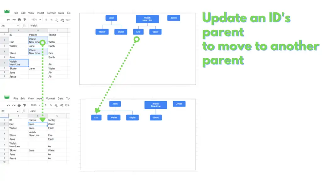
You can change which parent an ID will be under by changing the parent. This will also move all of the elements that consider the ID as a parent.
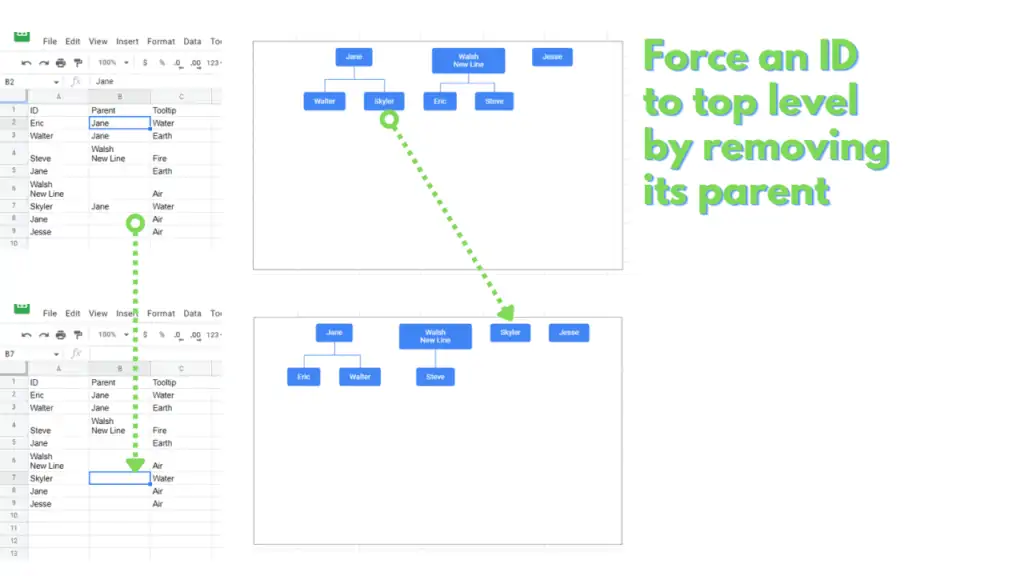
You can make an ID a top-level element by removing its parent.
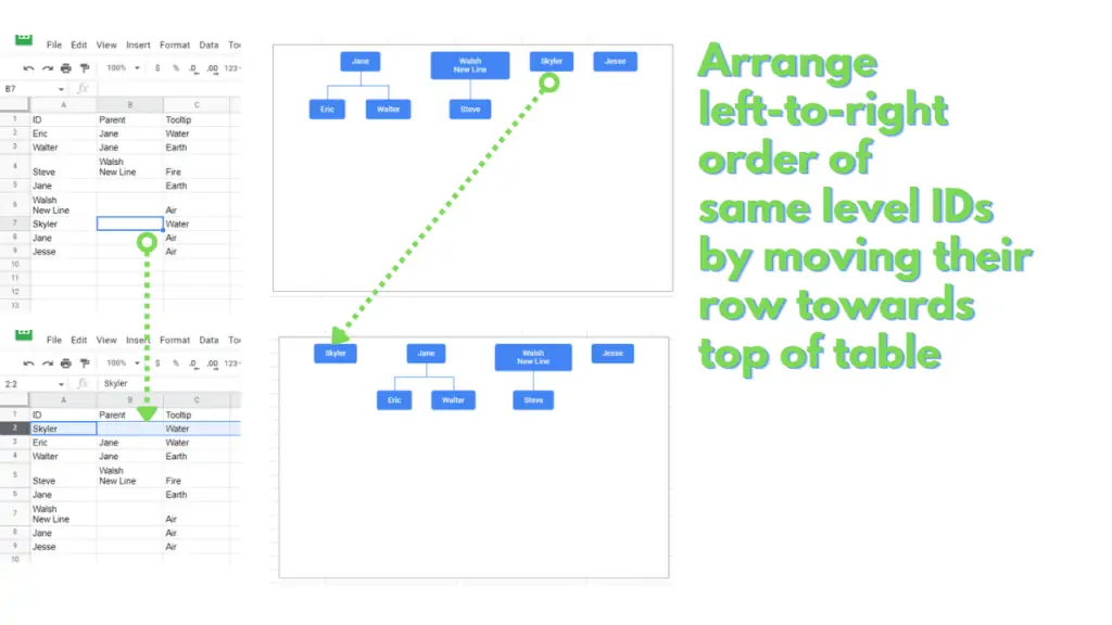
Finally, you can alter the left-to-right order of each level by moving their respective rows.
The Organizational chart will display on the leftmost part of the chart, the topmost entry on the table for each hierarchical level.
This will also move all of the elements that consider the ID as a parent.
Frequently Asked Questions on How to Create an Organizational Chart in Google Sheets
How do I create an Organizational chart in Google Sheets?
Select a table that contains the names/positions for an organization in one column, who they report to on another column, and an optional tooltip on another column. Insert an Organizational chart by clicking “Insert” from the menu bar, then by clicking “Chart”, then by selecting “Organizational chart” under the “Chart type” section of the “Chart editor” panel.
Is there a way to specify the font used for an Organizational Chart in Google Sheets?
Currently, the Organizational chart will only use a white-colored Arial font, whose size is based on the size selected under the chart’s Customize tab.
Is there an easier way to reorder the elements for my Organizational Chart in Google Sheets?
You can use what’s commonly called a “Helper column” to sort your chart as you see fit. On a new column, simply enter the numbers that represent the order you want the elements to appear (1, 2, 3, 4, etc.). Once entered, select the original range together with the helper column. After selecting, right-click on the selection then click or hover over “View more cell actions” then click “Sort range”. This should open up the “Sort range” dialog box. On the dialog box, select the column letter of the “Helper column” that you created, then select the A-Z option. Finally, click “Sort”. This will impose the order that you’ve provided for your table without the need for you to move around the respective range for the elements for your Organizational chart.
Conclusion on how to create an Organizational Chart in Google Sheets
First, select the table to use for your Organizational chart by click-dragging through the range, clicking the corresponding column letters, or by providing the range address through the name box.
Next, insert a chart by clicking “Insert” from the menu bar, then by clicking “Chart”. Switch the chart’s chart type from a Column chart to an Organizational chart by clicking on the kebab button on the chart’s upper right corner, then by clicking on “Edit chart”. On the “Chart editor” panel, click on “Column chart” from the “Chart type” section then switch it to “Organizational chart”.
You can customize the Organizational Chart’s Size, Node color, and Selected node color through the “Chart editor” panel’s customize tab.
Alternatively, you can customize the Organizational Chart by changing the values in the source table.