Pivot tables, charts, and graphs are some of the best ways you can visualize your data in Google Sheets. That said, they are not easy to use and complicated for the regular user.
It’s even more difficult to change the view of a pivot table, chart, or graph manually but there is a solution for this – using Slicers in Google Sheets. I have been using slicers as an easier way for my colleagues and me to change the filtering of data.
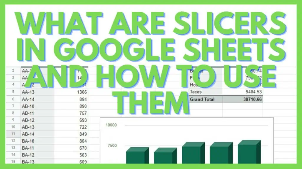
In this tutorial, I am going to show you what slicers are in Google Sheets and the best tips &tricks on how to use them.
How to Use Slicers in Google Sheets
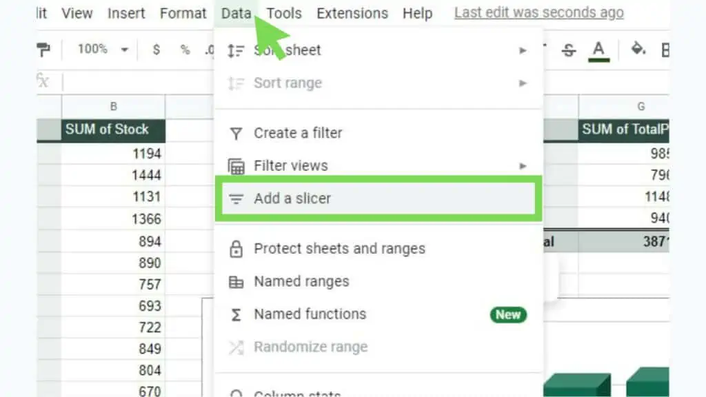
- Go to the ‘Data’ menu
- Click on ‘Add a slicer’
- Select a data range and hit OK
- Choose a column
- Modify your pivot table or charts using the slicer

What are Slicers in Google Sheets and How to Use Them Video
Slicers in Google Sheets
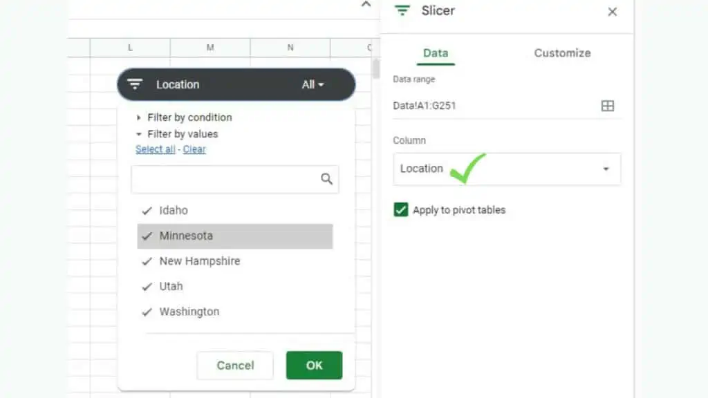
The SLICER bar, or widget, allows users to filter the spreadsheet by conditions or by values.
To change what the slicer is filtering, click the funnel icon at the left of Slicers in Google Sheets. Take note that a single slicer can filter both by condition and by values.
Setting up Slicers in Google Sheets
It’s easy to set up Slicers in Google Sheets once you know how to do it the first time.
To start, go to the ‘Data’ menu and select ‘Add a slicer’.
A small window will show up and here you must select a data range.
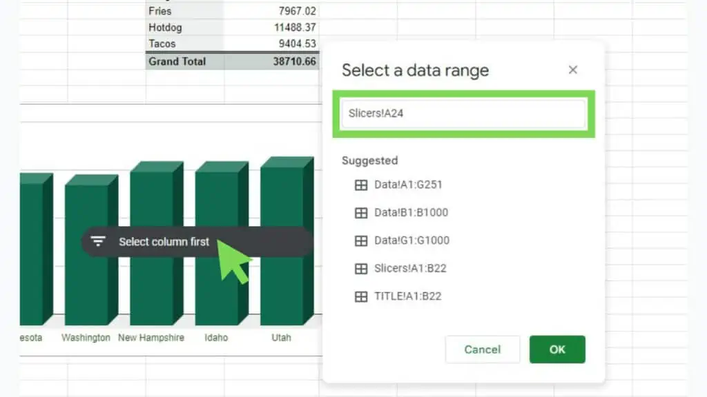
Caption: The ‘Select a data range’ window for Slicers in Google Sheets
For this example, I’ve selected a fairly big dataset that I have on a separate sheet.
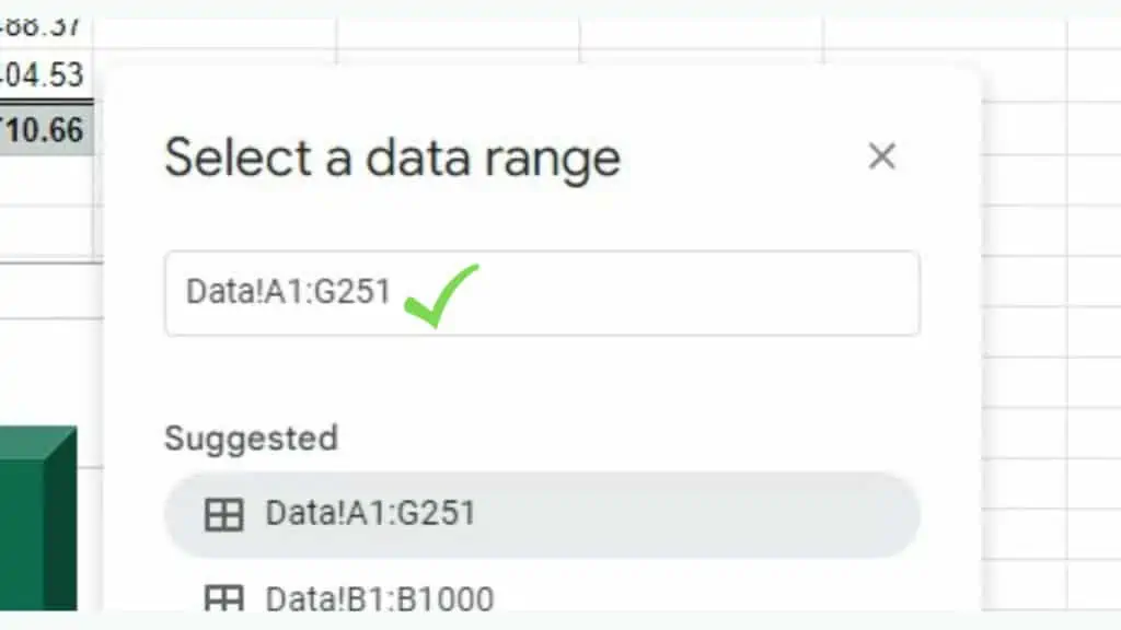
Once you have selected a valid data range, the next thing to do is to choose a column.
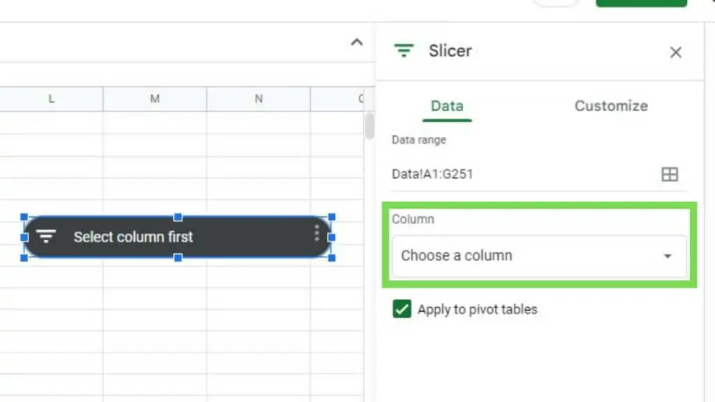
This will now give you the different filtering options that you can use to “slice” your data.
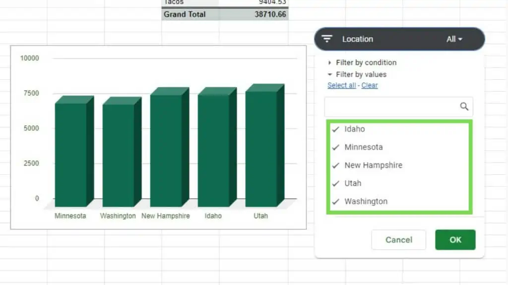
In the example below, you can see a chart dependent on the same data range as the slicer. No changes have been made yet.
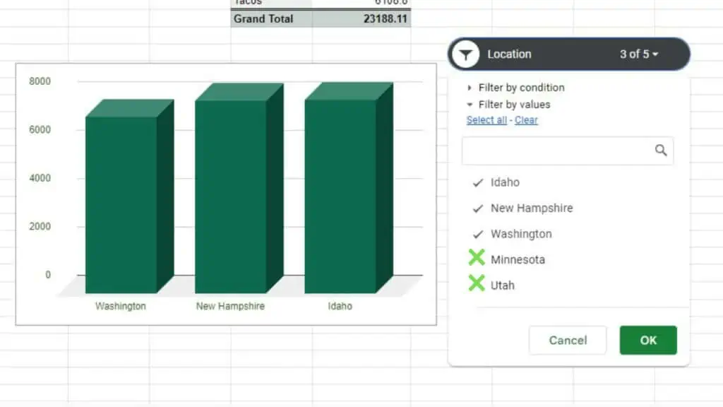
In the next image, I have deselected two locations causing the graph to only keep showing the remaining three out of the five locations.
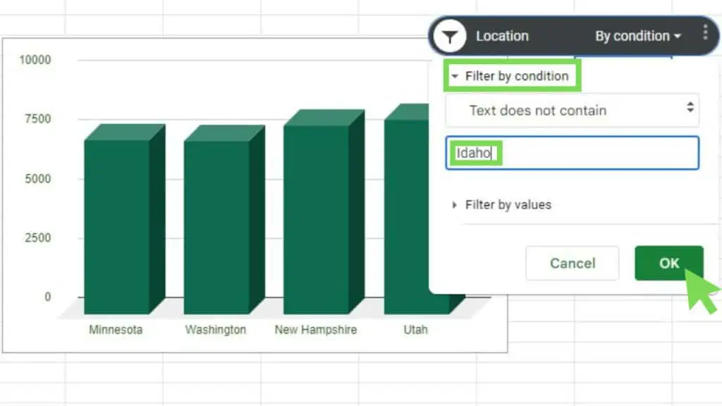
Other than the usual ‘Filter by values’ option, I can also use the ‘Filter by condition’ one, as seen below.
I’ve selected the ‘Text does not contain’ and put ‘Idaho’ as its value. In an instant, the value for ‘Idaho’ in my bar graph was removed.
These are just some ways how to use slicers in Google Sheets. To take advantage of this amazing feature, it’s best if you can learn more about different ways of using the ‘Filter by condition’ option.
Customizing Slicers in Google Sheets
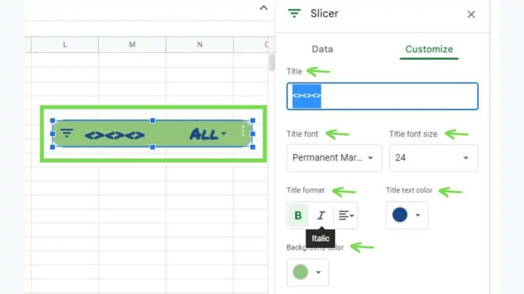
Slicers in Google Sheets offer limited options in terms of customization. Nonetheless, you can personalize how the Slicer widget looks.
Some options that you can change are the following:
- Title
- Title font
- Title font size
- Title format
- Title text color
- Background color
This will change the text that is shown on your slicer bar and modify how it looks depending on your settings.
I played around with the customize tab of Slicers in Google Sheets and did some changes in all the possible options.
The great thing about Slicer’s customization is that you can use this to make your slicer match the design of the rest of your spreadsheet.
Check out my other tutorials if you want to learn about Pie Charts, Line Graphs, or Pivot Queries.
Frequently Asked Questions about What are Slicers in Google Sheets and How to Use Them
How can I produce slicers in Google Sheets?
Go to the ‘Data’ menu and click on the ‘Add a slicer’ option. This will immediately produce a slicer but you still have to have a database that you can use as a data range for this slicer, your pivot tables, charts, and graphs.
Does modifying slicers in Google Sheets change the contents of my database used as the slicers’ data range?
The contents of your database which is used as your slicers’ data range will not be changed by modifying or filtering with slicers in Google Sheets. Slicers only give you options on how to easily update the view of your visualized data.
Conclusion on What are Slicers in Google Sheets and How to Use Them
To use slicers in Google Sheets you need to go to the ‘Data’ menu and click on ‘Add a slicer’. Select the data range, hit OK, and then choose a column. Finally, you can now modify your pivot table or charts using the slicer.