In this tutorial, I am going to guide you on how to make a Pareto chart in Google Sheets.
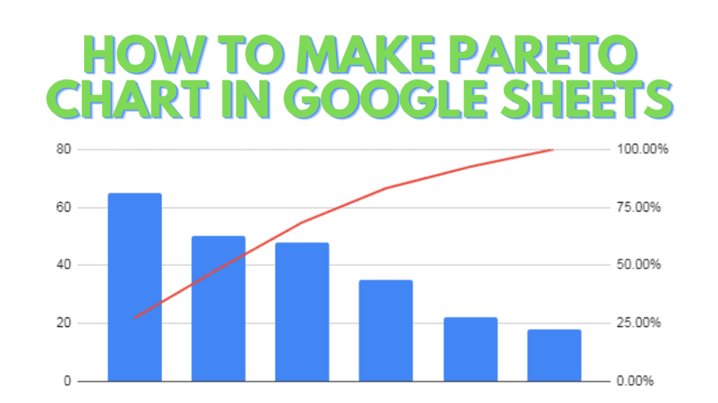
A Pareto chart is a combination of two types of charts i.e. a bar chart and a line chart.
The bars in every Pareto chart are a visual representation of ‘individual frequencies’ while the Line represents the ‘cumulative frequencies’ (which you will find by applying some formulas).
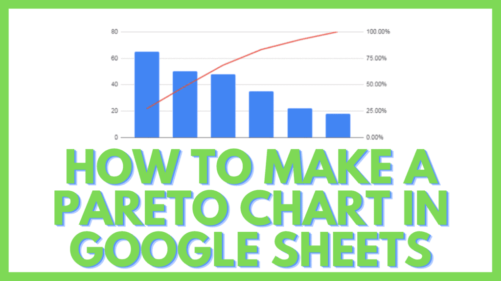
The data set is always displayed from largest to smallest. Here is an example of a Pareto chart in Google Sheets:
How to Make a Pareto Chart in Google Sheets
To make a Pareto chart in Google Sheets:
- Add data to a Google Sheet
- Sort data in descending order depending on their count/frequency
- Find the Cumulative Frequency in percentage (%) for each item
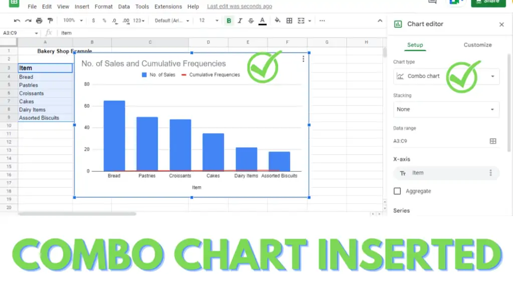
- Inset a ‘Combo Chart’ by selecting the data, clicking on ‘Chart’ in the ‘Insert’ tab
- To add a ‘Right Axis’, in the Chart Editor, go to Customize tab, then Scroll to ‘Series’
- Change the Series from ‘Apply to all series’ to the ‘Cumulative Frequency’
- Change the ‘Axis’ from ‘Left axis’ to ‘Right axis’
- Pareto Chart is ready
How to Make a Pareto Chart in Google Sheets Video Tutorial
Make a Pareto Chart in Google Sheets – Step by Step
The question now is how do you make such as Pareto chart?
To create a Pareto chart in Google Sheets, you need to have data that contains different numbers that represent amounts or frequencies.
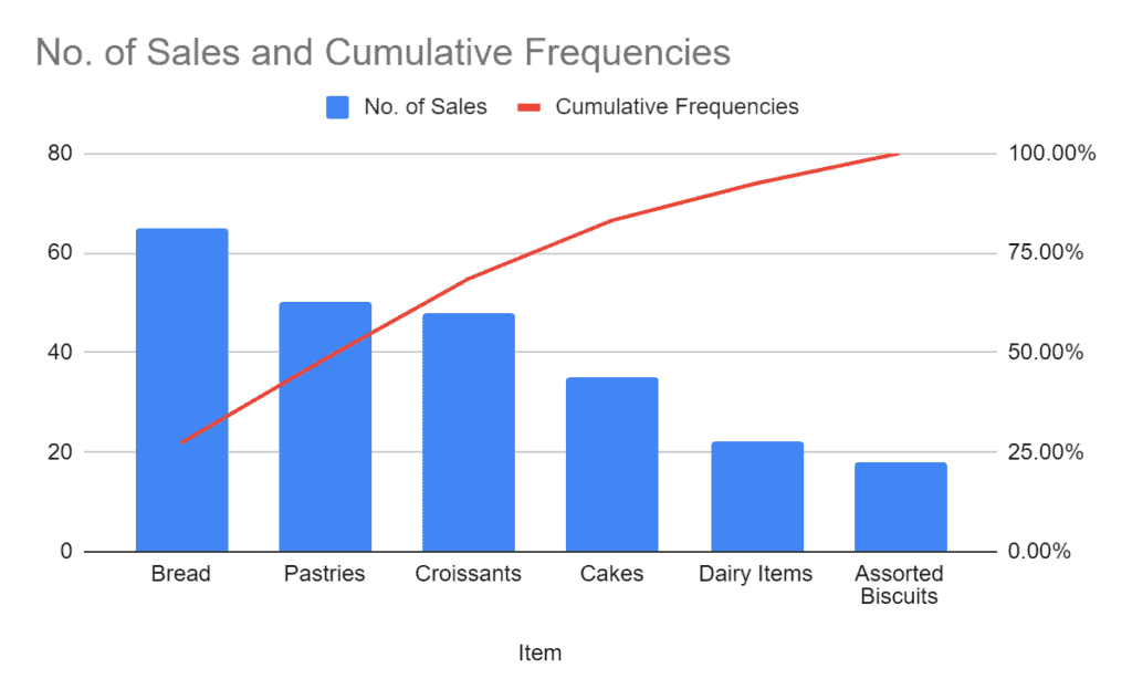
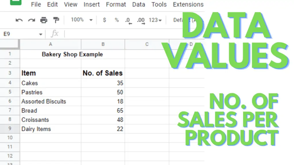
(Example) Say you are an owner of a bakery shop that sells many different items like cakes, pastries, assorted biscuits, bread, croissants, and dairy items.
There will be a specific amount of these products sold every day, RIGHT?
For example, let’s say you sold 35 cakes, 50 pastries, 18 assorted biscuit packs, 65 loaves of bread, 48 croissants, and 22 dairy items.
I entered all this data in a Google Sheet in two different columns, like this:
Now let’s make a Pareto chart out of this data.
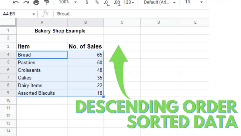
Step 1 – Arrange the Data in Descending Order
As I mentioned earlier, for creating a Pareto chart you first arrange your data in descending order (from large to small), then you can continue with the next steps:
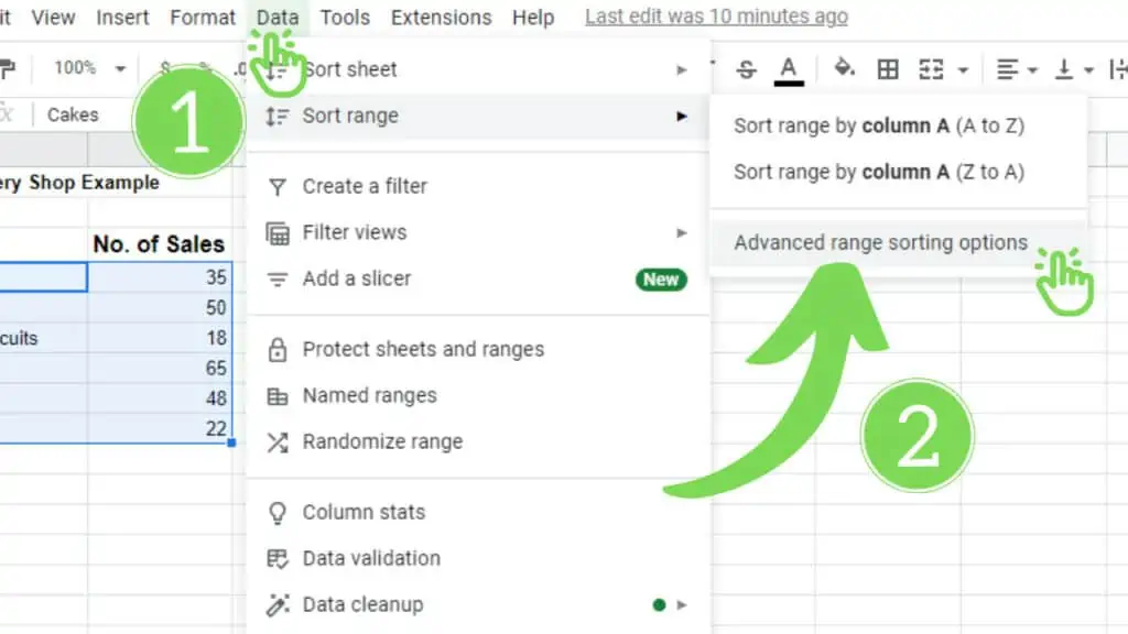
- Select the two columns in which you just entered the data. (You may or may not select full columns, skip the heading of the columns, and just select the specific cells of the two columns which contain required data, A4: B9 in my case).
- Now, click on the Data Tab. A list of commands will provoke, Go to Sort range.
- In Sort Range, click on Advance Range Sorting Options.
You can also access the sorting options pop-up box by Right Click on the selected data, then >View more cell actions (if any), >Click on Sort range:

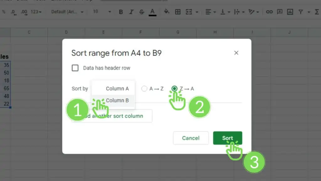
- A dialogue box with different sorting options will appear on your screen. You just need to make two changes to it:
- Change Column A to Column B in Sort by command.
- Select Z –> A.
- After making the changes mentioned above, click on Sort.
Your data will now be arranged in descending order.
Step 2 – Calculate the Cumulative Frequencies
Now, we need to calculate the Cumulative Frequencies. For this purpose, we need to apply a formula in the adjacent column to No. of Sales column. You can follow these steps:
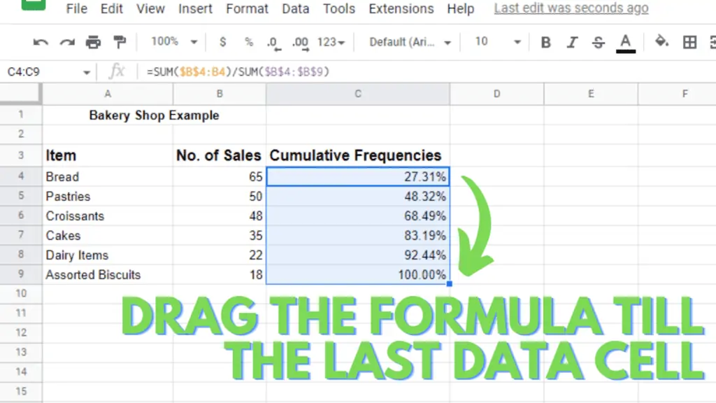
- Name the column as Cumulative Frequencies and apply the given formula tin the first cell (C4, in my case):
=SUM($B$4:B4)/SUM($B$4:$B$9)
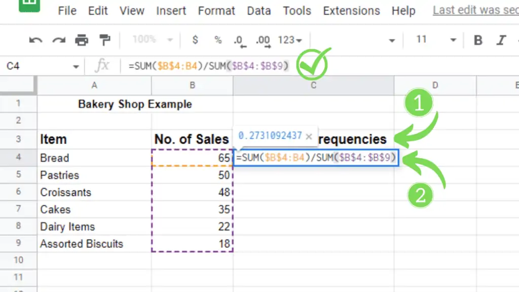
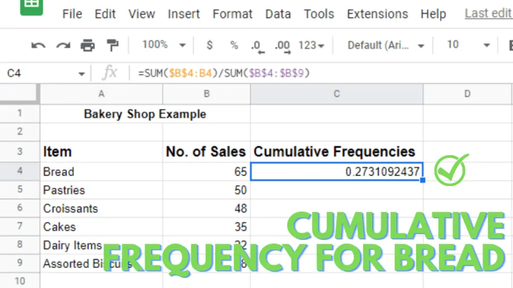
- Press Enter and you will see a value in the cell. That value is the cumulative frequency for Bread.
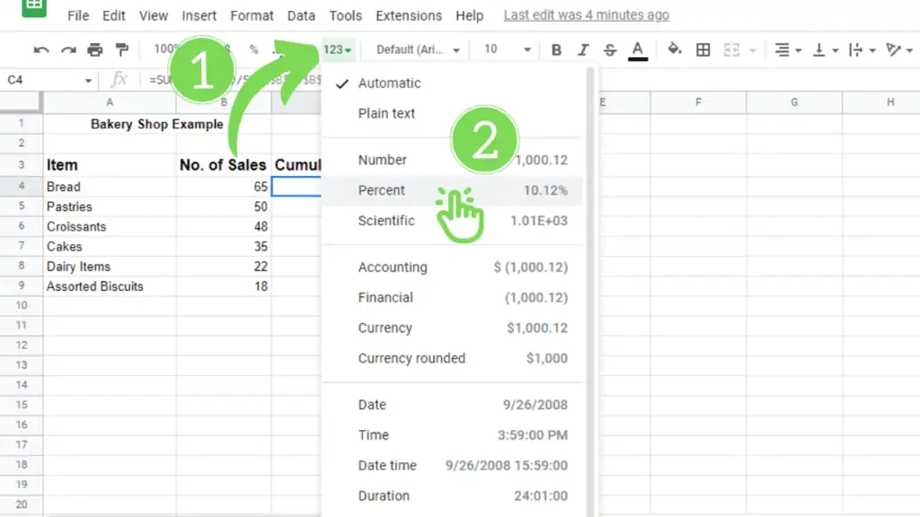
- You can change the cell formatting to Percentage (%) for better readability and understanding:
- Apply the above formula in each cell up to the last item. Simply drag it downwards to the last data cell (C9, in my case).
Step 3 – Insert a Combo Chart
This is the easiest of the all steps. For inserting a Combo chart, you just have to:
- Select all of the three columns that you have created in the Google Sheets
- Click the Insert Tab in the above ribbon. A list of commands will appear.
- Click the Chart option from the list.
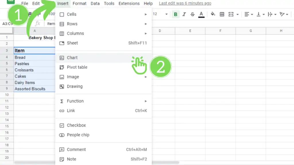
- This will automatically create a combo chart and prompt it in front of you.
Step 4 – Edit the Chart / Adding Right Axis on the Pareto Chart
Here editing the chart means making the Google Sheets chart show us what it intends to. For this purpose,
- We need to open the Chart editor (this may get automatically open on the right side of your screen as soon as you make the chart) or you can double-click on your chart and the chart editor pane appears.
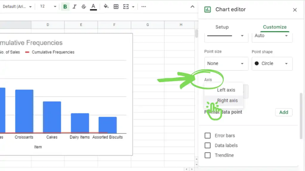
- Select the Customize tab. You will see many options below the customize tab. You need to click on Series.
- As soon as you select the series option:
- The first thing you have to change is the Apply to all Series to Cumulative Frequencies.
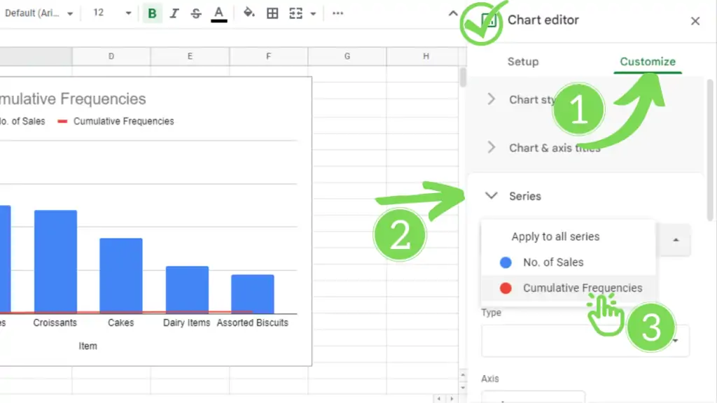
- Then you have to scroll down a little and you will find an option named ‘Axis’. Change that from the ‘Left axis’ to the ‘Right axis’ and that’s it.
- You will see a sudden change in the Red Line (representing cumulative frequencies) that goes from the bottom to its accurate place.
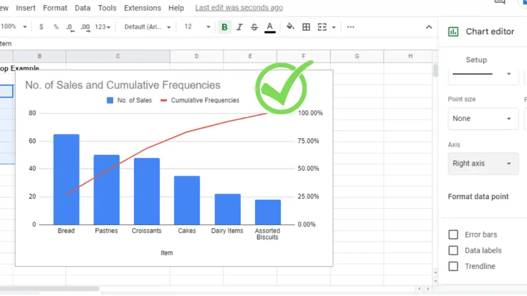
Your Pareto chart is ready.
Conclusion On How to Make a Pareto Chart in Google Sheets
To create a Pareto chart in Google Sheets you first need to sort the column with the occurrences from large to small by going to “Data” > “Sort Range”> “Advanced Range Sorting Options”.> Sort by “Column with the Occurences”. After this calculate the cumulative frequencies (Formula example: “Cumulative Frequencies =SUM($B$4:B4)/SUM($B$4:$B$9)”) in the adjacent column and use Formating to transform the numbers in to percentage values. Then mark all the columns and click on “Insert” > “Chart”. In the Chart Editor select “Combo Chart”, go to “Customize” > “Series” and select the “Cumulative Frequencies” column. Change he axis under “Axis” from “left axis” to “right axis”.