In this tutorial, I am going to guide you on how to make a dot plot in Google Sheets.
A dot plot or you may say a “dot chart” is a simple tool to visualize data points/values. The data is expressed in form of dots on the graph with either the x-axis or y-axis or both.
How to Make a Dot Plot in Google Sheets
To create a Pareto chart in Google Sheets:
- Add data to a Google Sheet
- Duplicate the 1st column values in the 3rd column
- Sequence the values by using the ‘Sequence()’ function in the 4th column (1,2,3,….)
- The data is now ready to insert a chart
- Inset a Chart by selecting the data in the 3rd & 4th column, by clicking on ‘Chart’ in the ‘Insert’ tab
- Change ‘Chart type’ from Line Chat to Scatter Chart
- Format your dot plot as per your requirements
- The Dot Plot / Dot Chart is ready
Creating a Dot Plot Graph Video Tutorial (Step-By-Step)
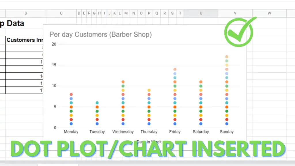
Dot Plot in Google Sheets Example
For a better understanding of the results, a small or medium-sized dataset is used for making dot plots as the visual representation is easy to interpret the results.
For your ease and better understanding, a dot plot or a dot chart made in Google Sheets is given below:
Make a Dot Plot In Google Sheets – Step by Step
For now, the biggest question mark is that Google Sheets do not give you an option of a dot plot or dot chart when you go to the insert tab and click “Chart”.
This is because in Google Sheets the Column Chart functions almost the same as a dot plot does but without the representation of dots.
But the good news here is that despite not having the option of making a dot plot or dot chart in Google Sheets still, you can make it by various methods.
Now let’s begin and make a Dot plot in Google Sheets.
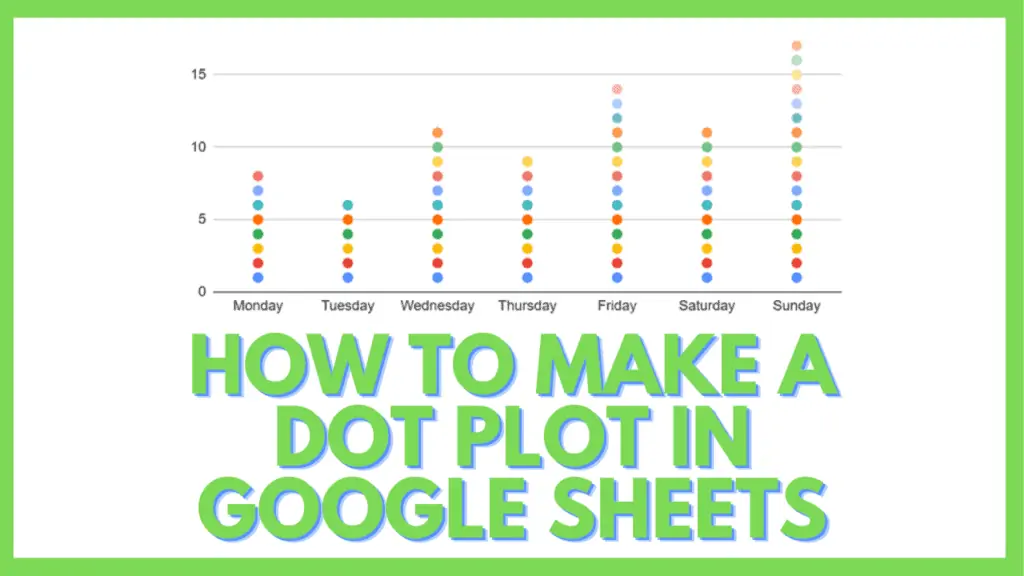
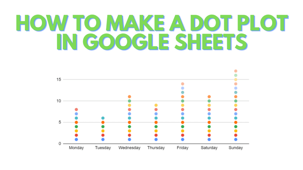
Suppose you are an owner of a Barber Shop and you want to find out on which day of the week you made the most sales by providing haircuts to your customers.
During the whole week, different customers come at different times. Say, on Monday 8, several customers came for a haircut.
On Tuesday, you had 6 customers.
On Wednesday, 11 customers came to your shop for a haircut.
On Thursday, you gave a haircut to 9 customers.
On Friday, a total of 14 customers were given a haircut.
On Saturday, you had 11 customers and on Sunday you dealt with 17 customers that were demanding a haircut.
I entered this data in Google Sheets in the following manner:
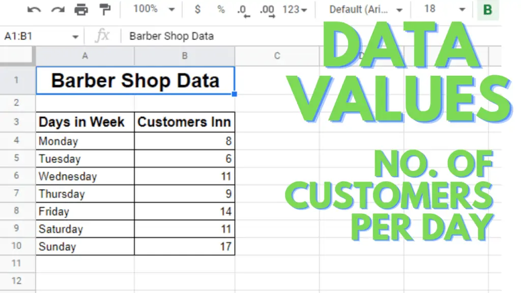
Step 1 – Setting up Data Sheet
To create a dot plot or dot chart in Google Sheets you first have to add some data. As I just illustrated in the above example:
- Create a similar sheet of data as shown above.
- Add the same column of days of the week in Column C just adjacent to the Customers Inn column.
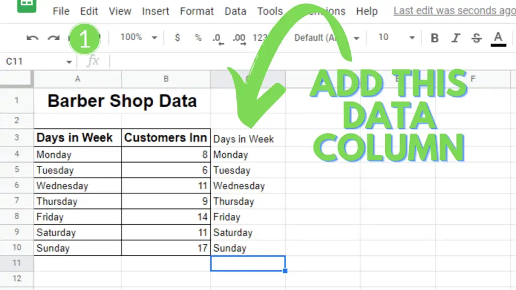
Step 2 – Apply the Formula
Ok, so the next step is to apply the following formula in the next adjacent column. It will be Column D in our case.
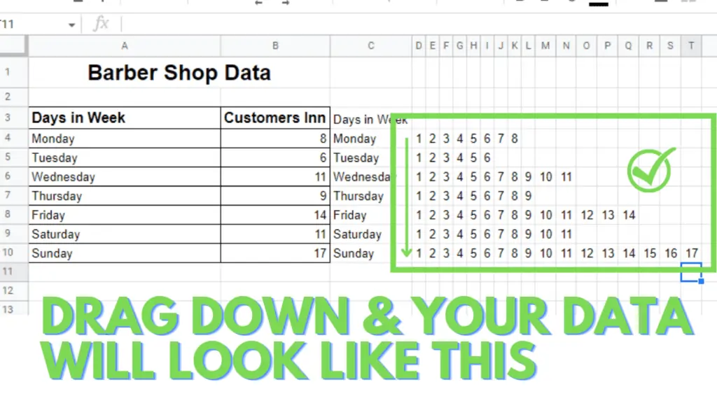
At first, you will apply the formula in cell D4 in our case and then you may drag it down or copy it till the last data row, that is row 10 in my case.
- Applying the Sequence formula
=SEQUENCE(1,B4)
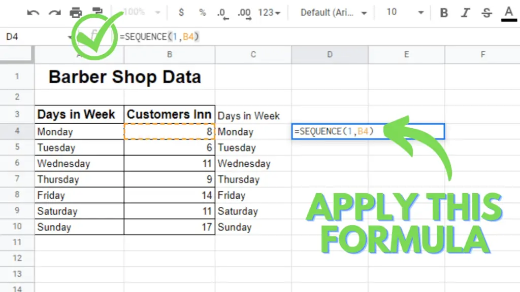
- Now just drag the above formula from D4 to D10 or you may copy it in each cell up to D10. After this, your data will look like the following sheet.
(Note: You can adjust the width of the columns to get all the values on your screen.)
Step 3 – Create a Dot Plot or Dot Chart
In this step, you will create your dot plot. Of course, as I mentioned earlier you won’t be getting a straight-way option of dot plot or dot chart in your Google Sheets.
So, for making a dot plot you need to go through the following steps.
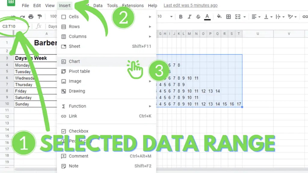
Selecting the data
- Select the range of data in your Google Sheet.
You won’t be selecting the entire data here just the columns from Column C and onwards. Like in this example, you will select the data range from C3 to T10.
Inserting the Chart
- After selecting the data you have to click on Insert Tab that is present in the ribbon just below the title area in the spreadsheet.
- Just as you click on insert, you will see a list of commands will appear. Select the Chart option from that list. The Google Sheets automatically will make you a graph but still, it is not a dot plot.
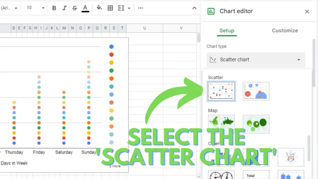
Converting to Dot Plot
- Open the Chart Editor. This may open automatically on the right side of your screen as you build the chart or just double-click anywhere on your chart and the chart editor pane appears.
- Change the chart type to Scatter Chart.
- And you will get your Dot plot or Dot chart.
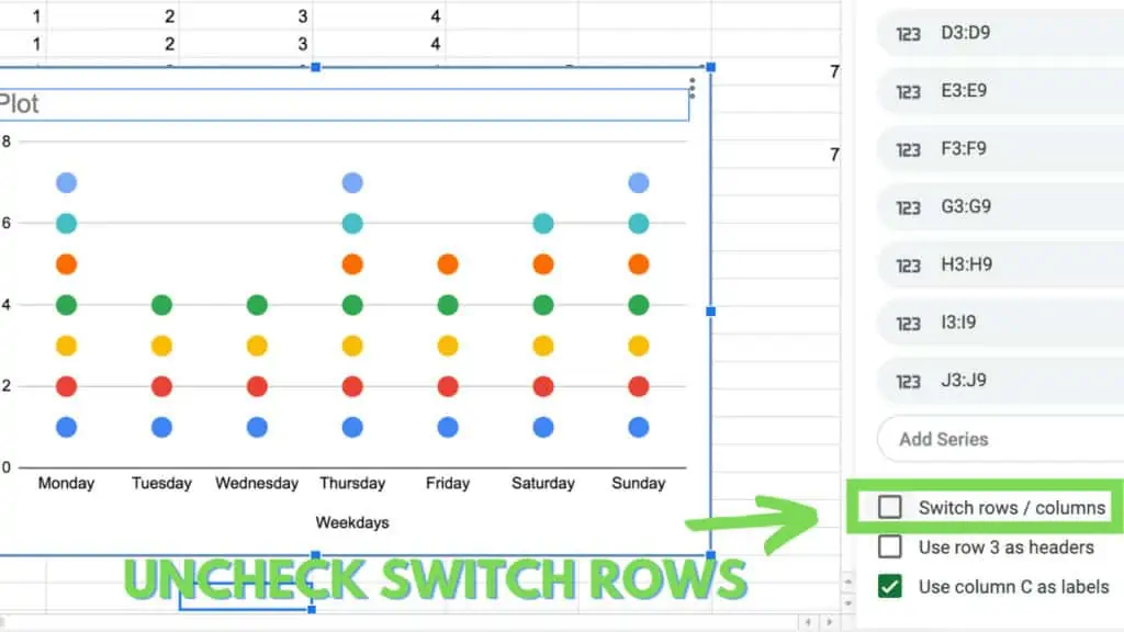
After changing to “Scatter Chart”, uncheck “Switch Rows” almost at the bottom of the “Chart Editor”
Step 4 – Editing the Chart
To make your chart look good you can make changes according to your own requirements in the customize tab under the chart editor.
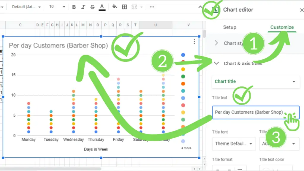
Add a Chart Title
You can give your chart an appropriate title. For this purpose:
- Go to the Customize tab in the chart editor.
- Scroll and click on the Chart title and axis heading.
- Write an appropriate chart title under the heading Title text.
Deleting the Legend
- In the customize tab, now select the option, Legend.
- Under the legend heading, you will see the first option of Position. Click on it and change it to None.
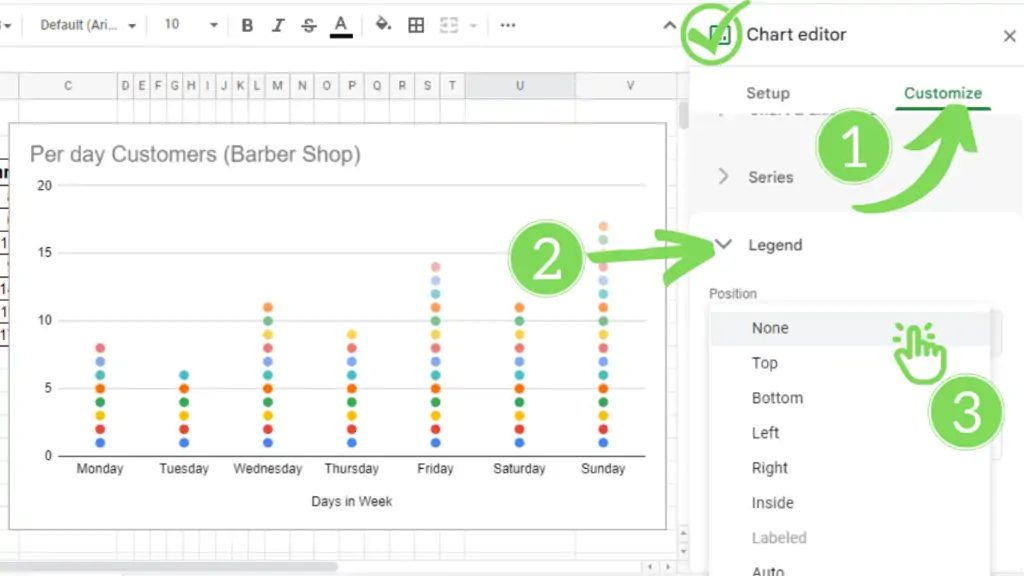
(Alternative Method: You can also delete the Legend by selecting it on the chart and pressing the ‘delete’ button from the keyboard)
Conclusion on How to Make a Dot Plot in Google Sheets
So, finally, your Dot plot or Dot chart is ready and you have successfully made it in Google Sheets despite Google Sheets not giving you an option of it though.
I hope this guide helps you in understanding How to Make a Dot Plot in Google Sheets by just following some really simple steps.