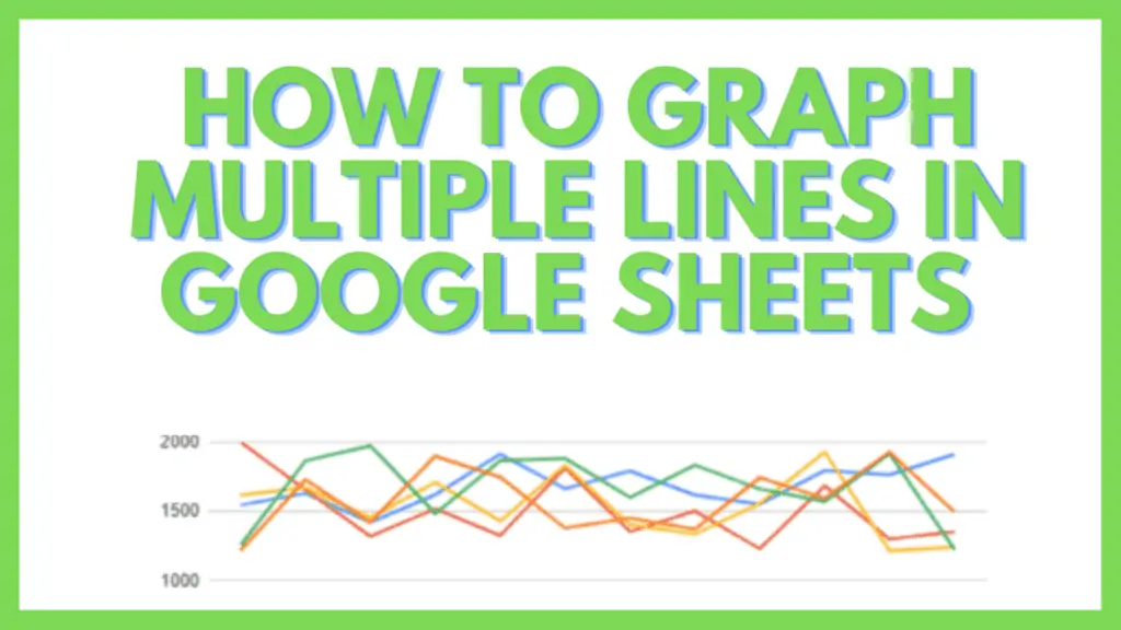
In this tutorial, I am going to guide you on how to graph multiple lines in Google Sheets.
A line chart is one of the most basic and simplest chart types to visualize a dataset.
It is also one of the oldest charts and still most commonly used by data analyzers because it is so easy to understand and analyze the given data.
In Google Sheets you can easily graph multiple lines in one chart and I am going to show you step-by-step how this is done.
A line chart uses values on the x and y-axis.
These data points are then plotted on the line chart.
Now, what if we want to plot the data points of more than one entity to show more than one line on a single-line chart?
How to Graph Multiple Lines in Google Sheets
To graph multiple lines in Google Sheets do the following:
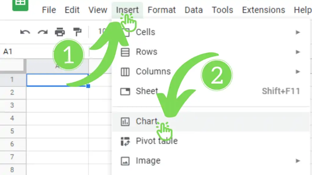
- Create a line chart by clicking on “Insert” then click on “Chart”
- If you marked multiple columns and rows with data, a multiple line chart will be created
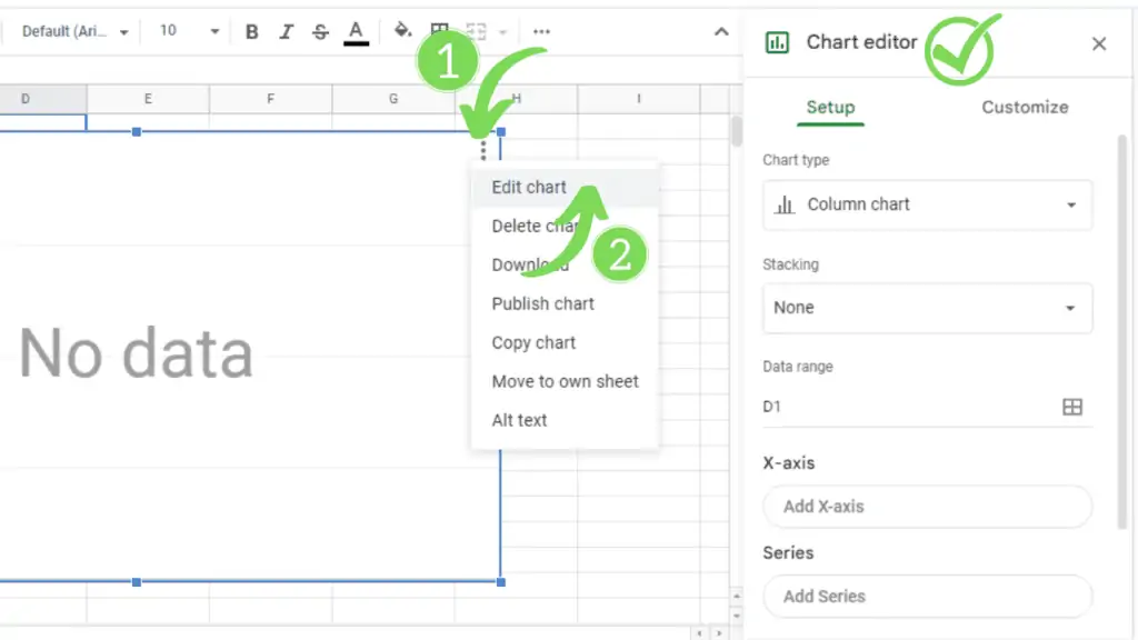
- To add or subtract lines click on the chart editor
- Double click on the chart area
- Click on the menu button on the top-right of the chart and click “edit chart”
- Now, scroll down to reach the “Series” heading in the Setup
- Click on the menu button of the series (three dots) to add or remove a series

How to Graph Multiple Lines in Google Sheets Video Tutorial
How To Graph Multiple Lines in Google Sheets Example
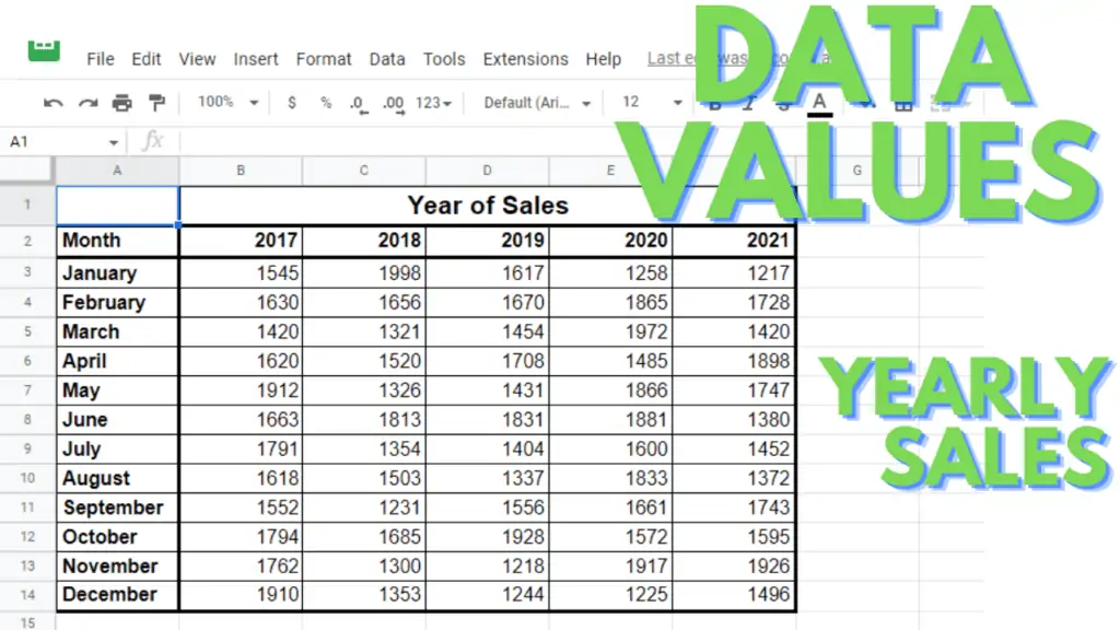
Let’s take an example of a Sales Manager of a bicycle-selling company who wants to compare his company’s monthly sales for the past 5 years (2017-2021).
Of course, he can go with five simple line charts, one for each year in which monthly sales are shown for the respective year. The problem with this method is that it is:
- Time-consuming
- Difficult to visualize together
- Difficult to compare
- A poor analysis overall
So, a better approach is to show all the lines on a single page and hence on a single chart. That chart will have five lines for five years and will show the monthly sales of the respective year, properly.
So, today you are going to learn how you can plot two or more (five in this tutorial) lines in a line chart.
Create a Line Chart in Google Sheets
There are two basic methods for creating a line chart in Google Sheets. You can have a look at my last post to learn about those methods.
Here are the simple steps:
- Click on the ‘Insert’ menu button/tab
- Click on ‘Chart’ (Chart will be inserted, column or line)
- Play with your chart
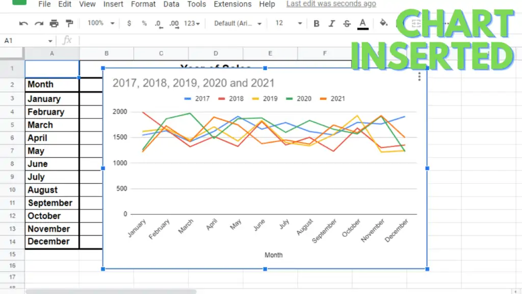
Now here in this case, as you can see, our selected cell (active cell, A1) is in the neighborhood of our dataset, Google Sheets shows us a multi-line line chart automatically which has five lines of different colors for each year.
Step 02 – Editing (adding or removing) Lines in the Google Sheets Line Chart
Now, let’s see how you can edit these lines that are automatically inserted into this line chart. You can add more lines or remove any of the already present lines.
- For that, you need to open the Chart Editor. See the step-by-step guide to open the editor in my previous post. Here are the simple methods:
- Double click on the chart area
- Click on the menu button on the top-right of the chart and click “edit chart”
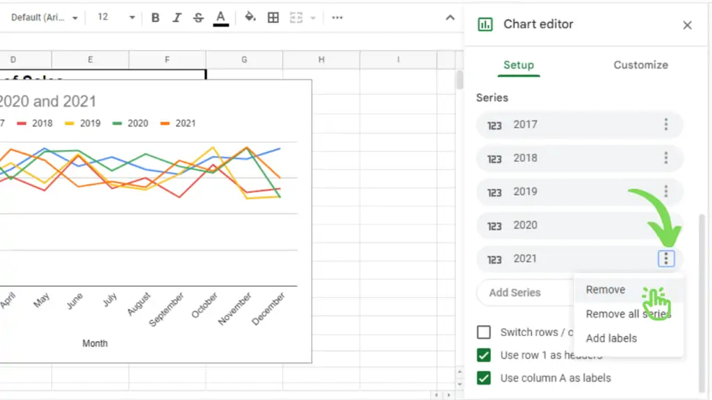
- Now, scroll down to reach the ‘Series’ heading in the Setup (by default selected tab of Chart Editor).
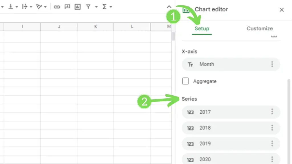
Here you will see all the series (no. of series = no. of lines) that are currently shown in the chart.
Remove a Series in a Google Sheets Chart
- Click on the menu button of the series that you want to remove (I’m going to remove 2021)
- Click on Remove
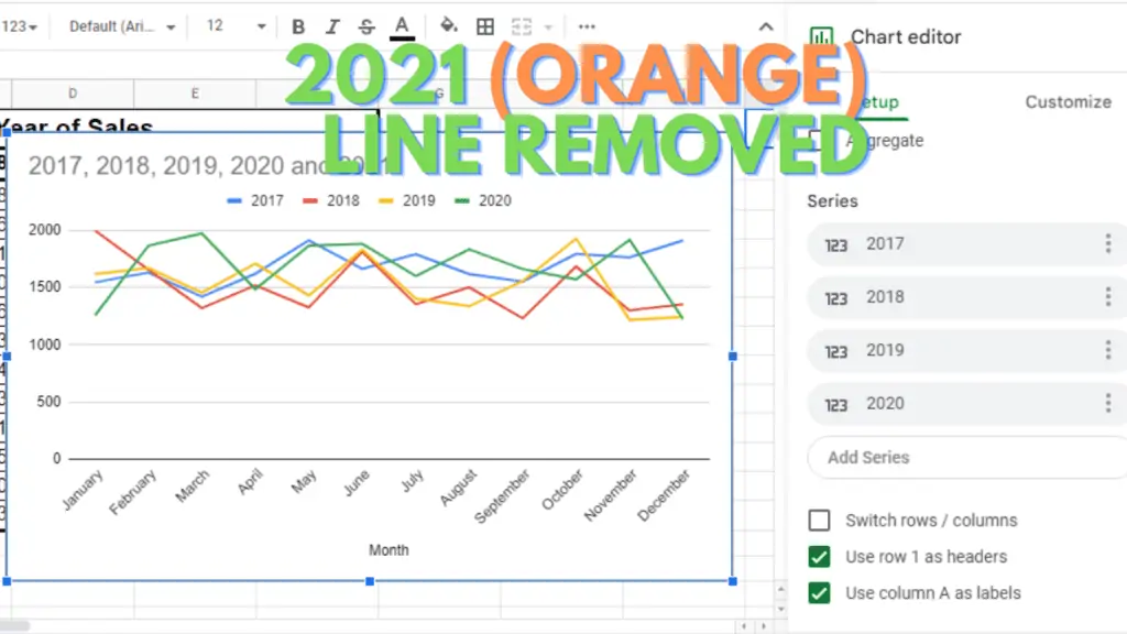
- The line for that specific series will be removed (2021, Orange color in my case).
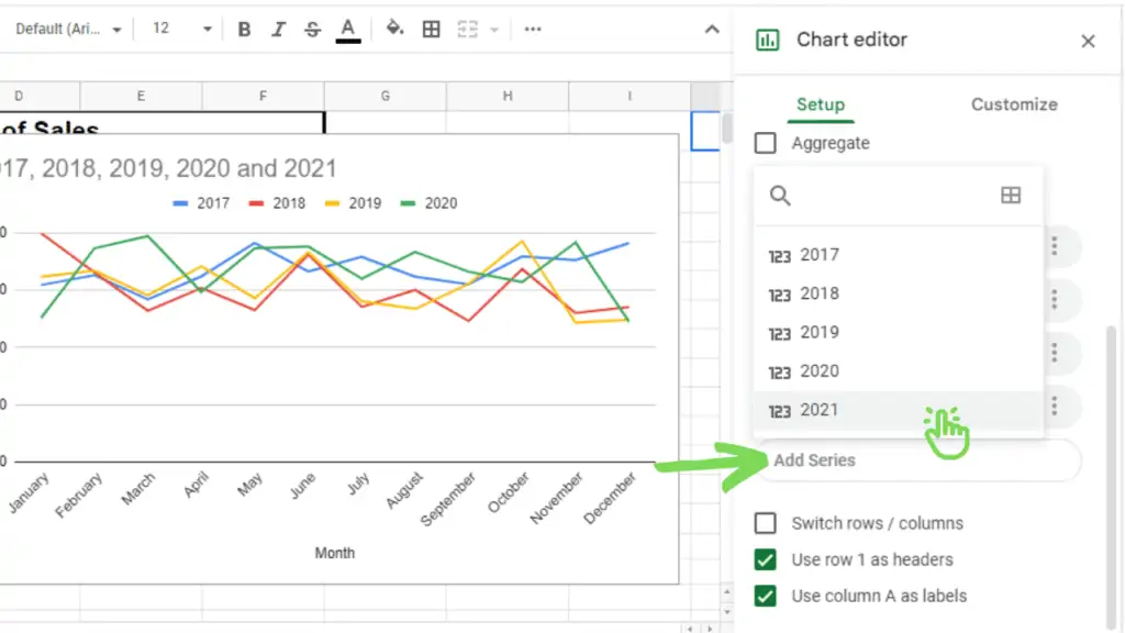
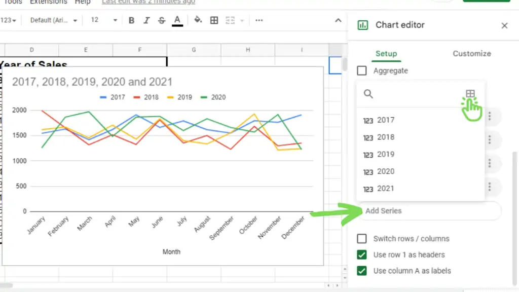
Add a Series in Google Sheets based on Suggestions
Now let’s learn how we can add a new series/line to the line chart.
- Just click on the “Add Series” (gray) button under the already present series.
- Click on any of the suggested available series. (2021, in my case)
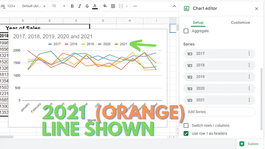
- The line for that specific series will be shown on the chart (2021, Orange color in my case)
Add a Series in Google Sheets Using A Custom Data Range
- Click on the “Add Series” (gray) button under the already present series.
- Click on the ‘Select a data range’ button on the top left.
- In the Select a data range input box in Google Sheets, type or select your required data series (2021 series in my case). Don’t forget to select an extra empty cell from the top, otherwise, you will miss your first value.
- Click Ok.
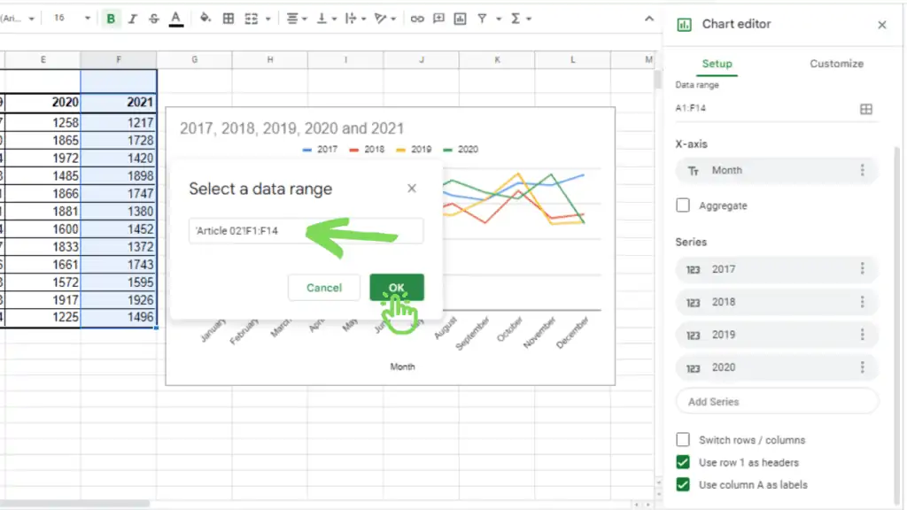
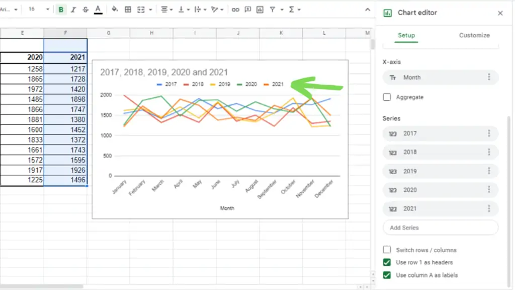
- A new series/line will be added to your chart. (2021 line in my case).
Conclusion About How To Graph Multiple Lines in Google Sheets
I hope this guide will help you learn how you can graph multiline lines in Google Sheets. If you have any confusion, you can just write a comment, I’ll try to respond as soon as possible.