In this tutorial, I am going to guide you on the steps of how to create a Pivot Chart in Google Sheets.
A Pivot Chart is any type of chart that references a Pivot Table, which itself is likely a condensed version of a larger dataset.
However, since there is currently no feature to create a Pivot Table directly from a dataset, we first need to create a Pivot Chart that we can use as a reference for the Pivot Table.
A good reason to use a Pivot Chart setup instead of a simple Chart is that because a Pivot Chart references a Pivot Table, the Pivot Chart will dynamically be updated with the contents of the Pivot Table.
Additionally, I find Pivot Charts to be especially useful in situations where I often change how my Pivot Table is set up. Like changing the filters, columns, or rows.
How to Create a Pivot Chart in Google Sheets
To create a Pivot Chart in Google Sheets:
- Add Data to Google Sheet
- Select the Data
- Create a Pivot Table by clicking ‘Pivot Table’ under the ‘Insert’ tab
- Select ‘New Sheet’ and press ‘Create’
- On the Pivot Table Editor, add ‘Row X’ for the Rows section
- Add ‘Column X’ for the Columns section, then uncheck the ‘Show Totals’ checkbox
- Add ‘Value X’ for the Values section
- Select the range from the created Pivot Chart
- Create a Chart by clicking ‘Chart’ under the ‘Insert’ tab
- On the Chart Editor, select ‘Stacked Bar Chart’ as the Chart Type
- The Pivot Chart is now ready
Creating a Pivot Chart in Google Sheets Video Tutorial (Step-By-Step)
How to create a Pivot Chart in Google Sheets – Step by Step
Now, how do we start creating a Pivot Chart?
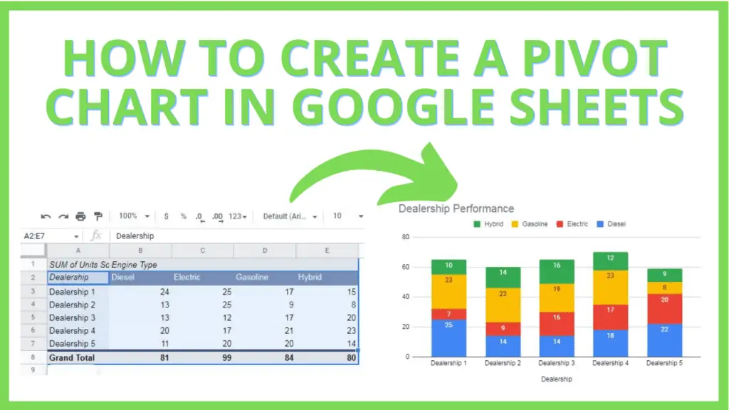
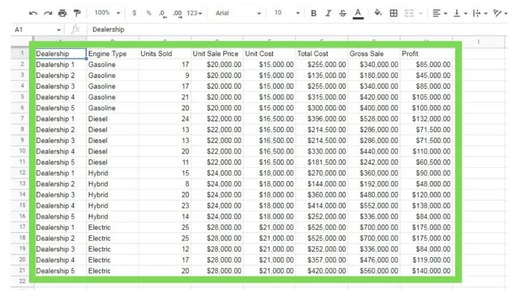
For our tutorial, we will be using a dataset that represents the performance of several car dealerships, with respect to the engine types that they have available.
Additionally, to highlight the advantages of a Pivot Chart, our dataset will contain values such as Units Sold, Unit Sale Price, Unit Cost, Total Cost, Gross Sale, and Profit, which we will be switching between later.
Step 1 – Add the Data to Google Sheet
Before everything else, we need to have a dataset that our Pivot Table, and eventually, Pivot Chart will be based on.
I created a simple dataset for us to use through this file. You may choose to copy the data and paste it to a different Google Sheet file or duplicate it by clicking ‘Make a Copy’ under the ‘File’ tab.
Step 2 – Create a Pivot Table
We need to create a Pivot Table to base our Pivot Chart of. You can follow these steps in creating a Pivot Table:
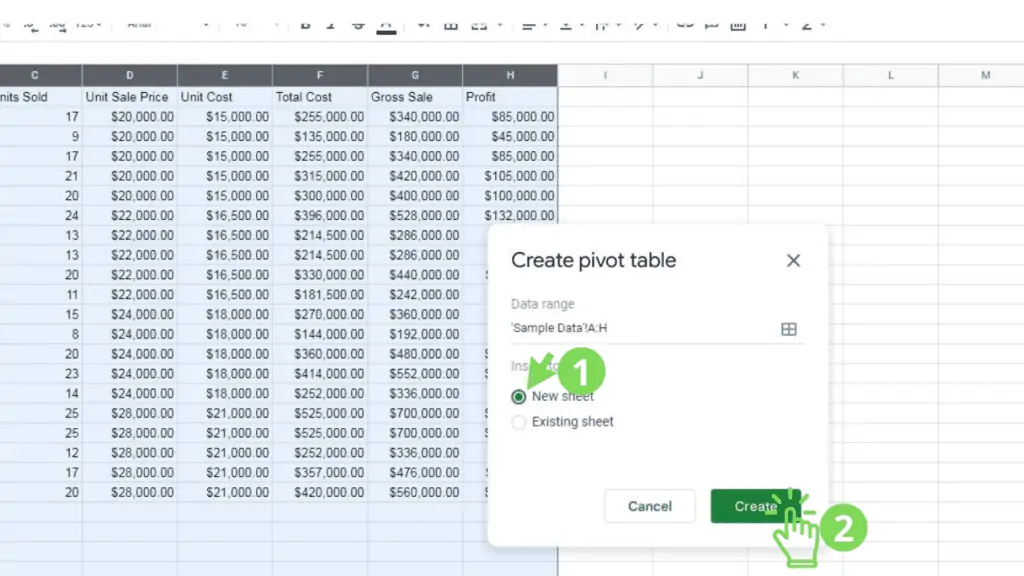
1. Select the dataset that the Pivot Table will be based on. Do this by either selecting just the cells that are filled in from our sample data set,
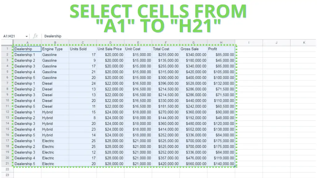
or selecting the columns (A through H).
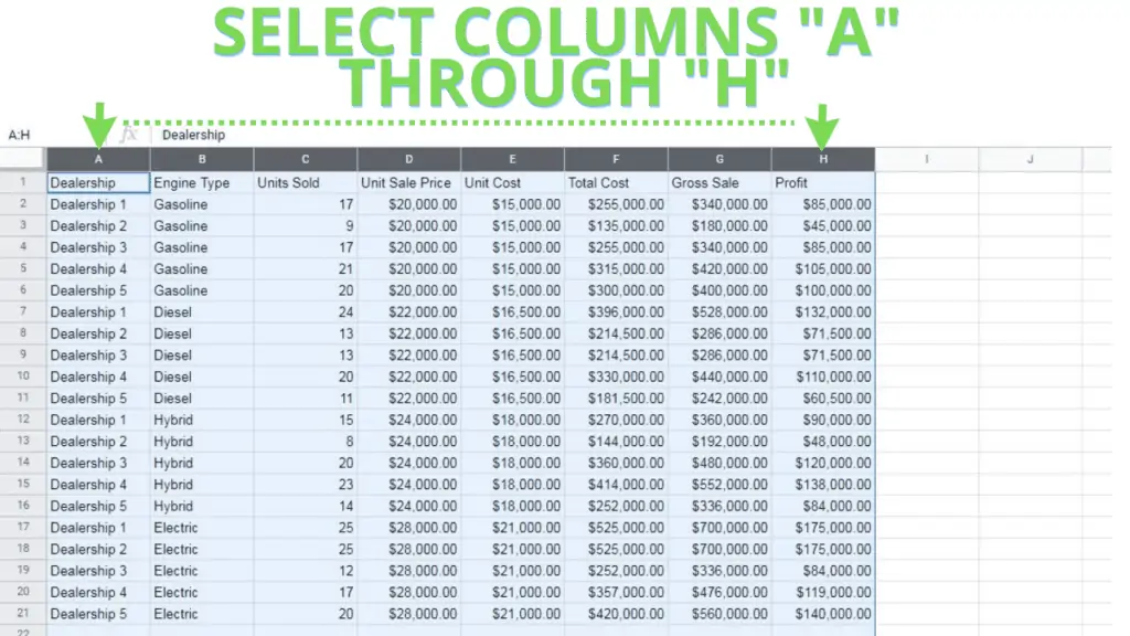
The latter will ensure that the Pivot Table will be updated whenever a new row is added to the dataset. Very useful for continually updated datasets.
2. Open the ‘Insert’ tab from the Menu Bar, then click ‘Pivot Table’. This should open a prompt.
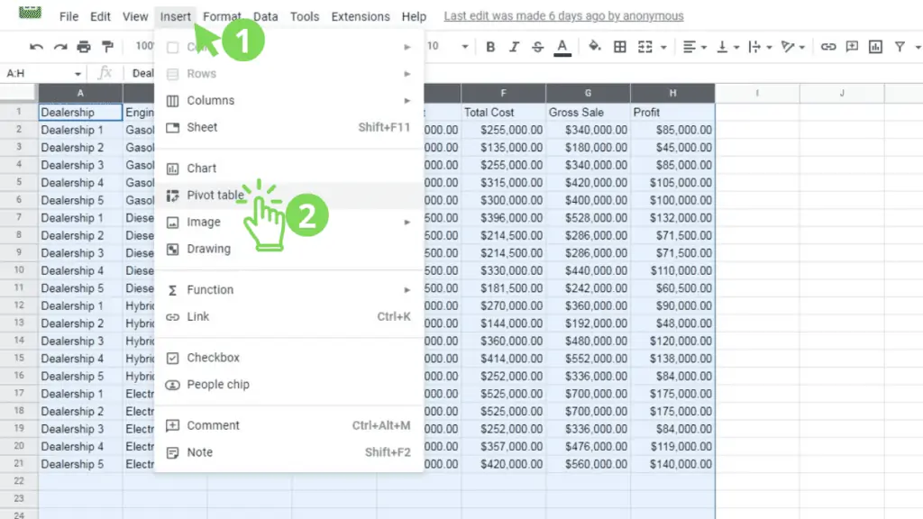
3. Select the ‘New Sheet’ option, then click ‘Create’
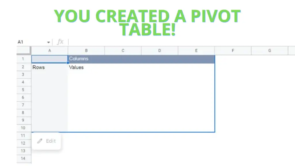
You’ve now created a Pivot Table from our dataset, which should look like this:
Step 3 – Configure the Pivot Table
Once we’ve created a Pivot Table, we must next configure it in such a way that our Pivot Chart can easily use it as a source.
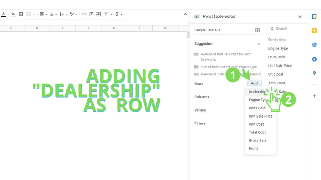
For our Tutorial, let’s assume that we want to see each Dealership’s Units Sold performance with respect to the Type of Engine that was sold. To do this you can follow the steps that I’ve laid out:
1. Specify ‘Dealership’ as a Row. Do this by accessing the Pivot table editor (this menu should appear by default after creating a Pivot Table), clicking ‘Add’ beside ‘Row’, then selecting ‘Dealership’
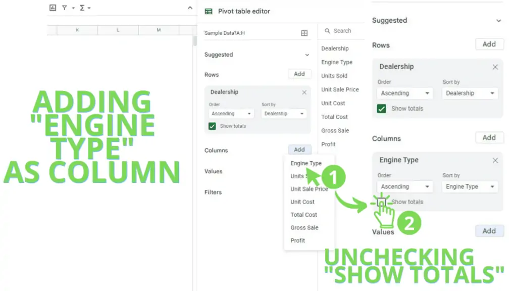
2. Specify ‘Engine Type’ as a column for the Pivot Table. Similar to the previous step, access the Pivot Table editor, then click ‘Add’ beside ‘Column’. From here, select ‘Engine Type’
Also, uncheck the ‘Show Totals’ checkbox for the Column. It doesn’t matter that much, but it helps in decluttering the Pivot Table that we’re setting up
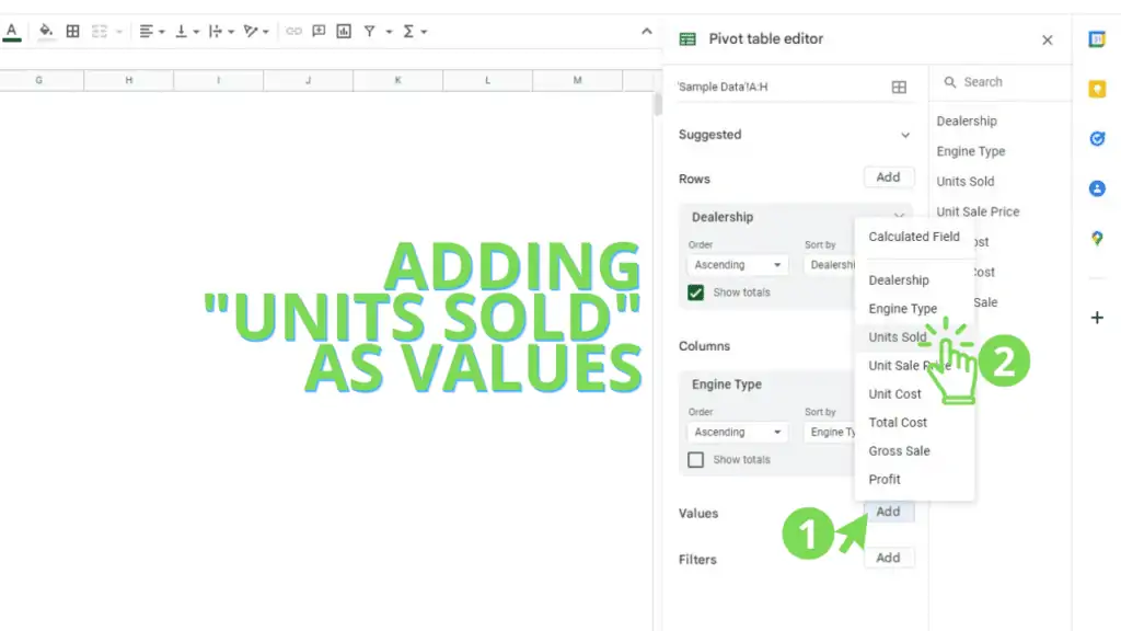
3. Specify ‘Units Sold’ as the Value. To set this up, access the Pivot Table editor, then click ‘Add’ beside ‘Values’. From here, select ‘Units Sold’
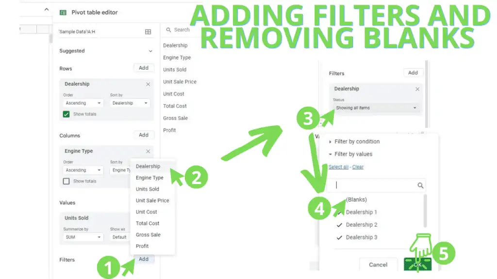
4. Add a filter to remove blank rows. To do this, access the Pivot Table editor, then click ‘Add’ beside ‘Filters’. From here, select ‘Dealership’. From here, open the ‘Status’ drop-down selection, uncheck ‘(blanks)’, then click ‘Ok’
You’ve now created a Pivot Table according to our needs. One that we can visualize using a Chart, a Pivot Chart!
Step 4 – Creating a Pivot Chart
Finally, we need to create a Pivot Chart in Google Sheets to visualize the data from our Pivot Table.
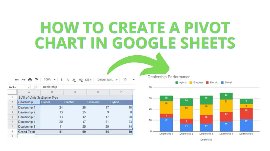
For the purposes of this Tutorial, you should use a ‘Stacked Column Chart’. You can use the steps I’ve laid out for us:
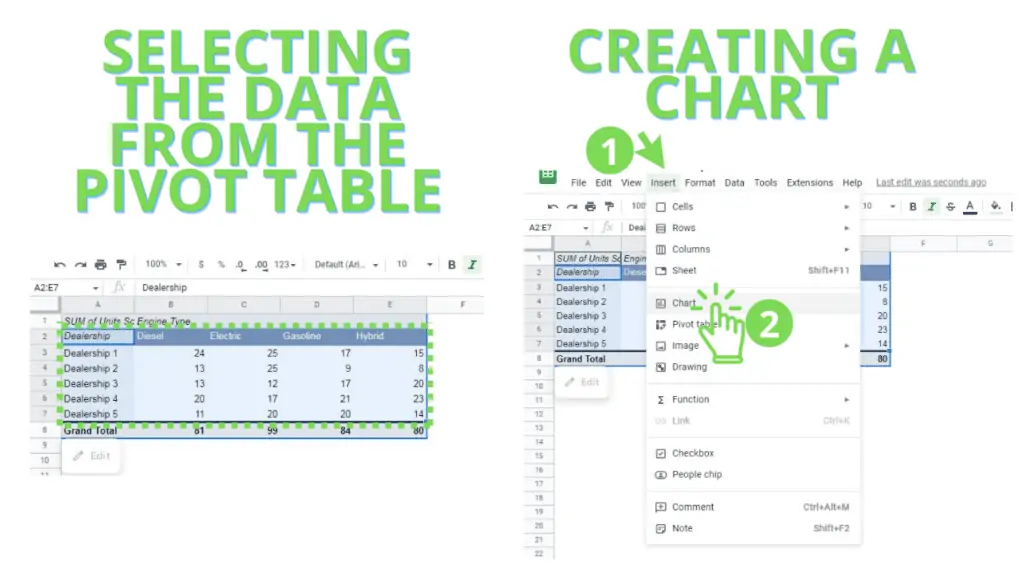
1. Highlight the Pivot Table from the intersection of the column and row headers to the value of the last row and column (A2:E7 in my case)
2. Click on ‘Insert’ from the Menu Bar, then select ‘Chart’. This should create a chart for you under the default or suggested settings.
Step 5 – Using a Stacked Column Chart (as needed)
If a ‘Stacked Column Chart’ is not the default chart generated for you, don’t worry, you can still configure your Pivot Chart to use this type of chart by following these steps:
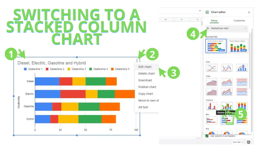
1. Access the Chart editor by selecting the chart
2. Click on the ‘kebab’ button (3 dots lined up in a column)
3. Click on ‘Edit chart’. This will open the Chart Editor pane on the right side of your spreadsheet
4. Access the Chart type drop-down selection
5. Select the Stacked column chart. You can hover over the thumbnails until the label appears, but the Stacked column chart should be the second selection in the Column chart section.
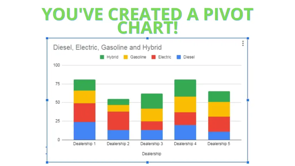
This is roughly how the Pivot Chart should appear for you:
Once you’ve created your Pivot Chart in Google Sheets, you can now reconfigure your Pivot Table to the other values instead of Units Sold. Simply revisit item number 3 in step 3 and select a different value.
Additionally, you can revisit the Chart Editor to further customize how the chart looks, how it’s labeled, how the column stacks are colored, etc.
With that, I hope this guide helped you in understanding the steps on how to create a Pivot Chart in Google Sheets.
Read about how to merge cells in Google Sheets next.
Frequently Asked Questions on How to create a Pivot Chart in Google Sheets
Will a Pivot Chart retain its look when changing the Pivot Table’s setup?
Google Sheets will try to retain the setup of the Pivot Chart when the source data is changed (Pivot Table), but drastically changing the Pivot Table, like adding more than 1 for Values, will likely break the Pivot Chart.
Do I need to create a new Pivot Table when I want to add a new Pivot Chart?
A Pivot Chart will always refer to a Pivot Table for data. This means that if you want to show the same data, but through a different type of chart, you can use the same Pivot Table. However, if you wish to show different combinations of values, rows, and columns on a new Pivot Chart, you will need to create a new Pivot Table.
Conclusion on How to create a Pivot Chart in Google Sheets
A pivot chart in Google Sheets can be created following these steps:
- Prepare your data on Google Sheets
- Highlight/select the data range or the columns with the data
- Create a Pivot Table based on the selected data
- Configure the Pivot Table to have the Rows, Columns, and Values you need
- Highlight/select the relevant cells (row headers, column headers, values) from the Pivot Table
- Create a Chart based on the selected data from the Pivot Table
- Configure the Pivot Chart to desired visualization