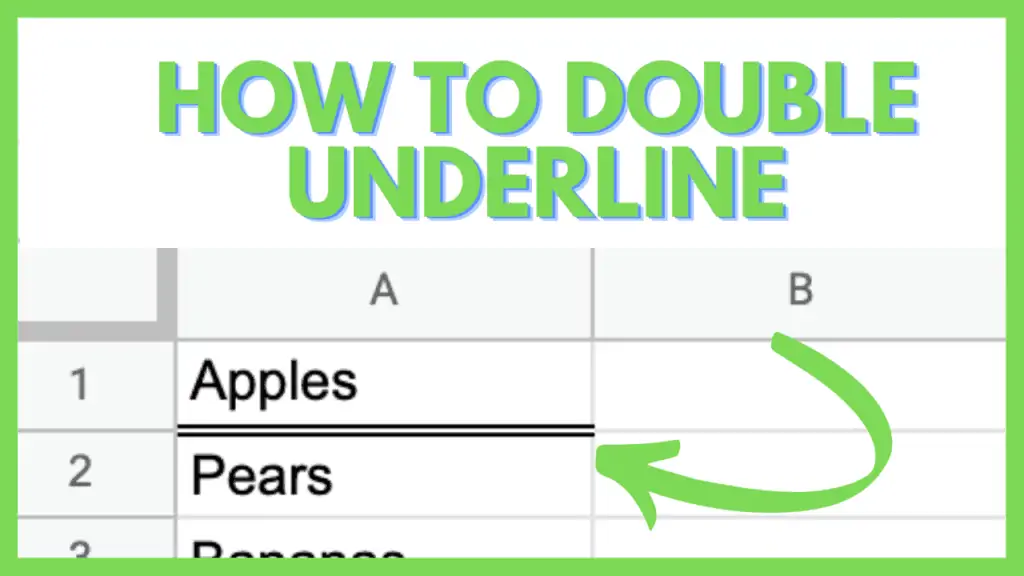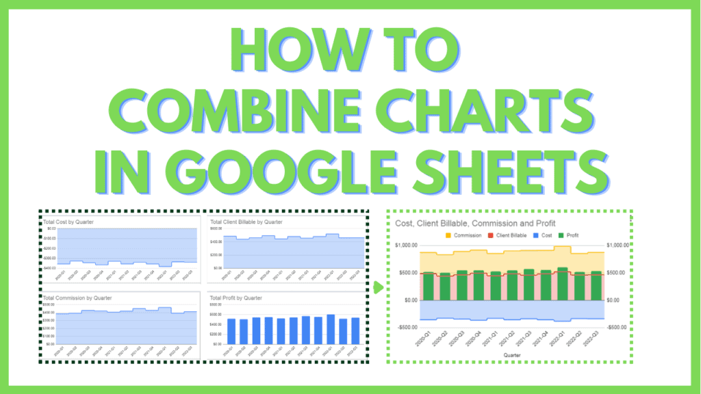
In this tutorial, I will show you how to combine charts in Google Sheets.
Charts are tools in Google Sheets that allow you to present your data in an easy-to-read manner that relies on visual elements, like bars, lines, area plots, etc.
And while charts are effective visualization tools that condense data into a smaller footprint, there is a point of diminishing returns where having too many of them defeats the purpose of effective visualization: showing data at-a-glance.
Burdening your audience with too many charts will reduce its effectiveness, which is why it is invaluable to know how to combine charts in Google Sheets when the situation calls for it.
Combined charts are set up using a combo chart. combo charts allow you to mix and match multiple values, and visualize them by way of Line graphs, bar graphs, area graphs, or stepped area graphs.
How to Combine Charts in Google Sheets
Steps on How to Combine Charts in Google Sheets:
- Identify which charts you want to combine using a combo chart
- Identify the source of values of the charts you want to combine using a combo chart
- Select the ranges for the values and Insert a combo chart
- Select Standard Stacking option
- Select the Graph type for the Series in your combo chart
- Select the Axis for the Series in your combo chart
- Match the Min and Max values of the vertical axes
For this tutorial, I will provide a sample file that will have 4 worksheets, with each worksheet representing a usual step in the process of data visualization.
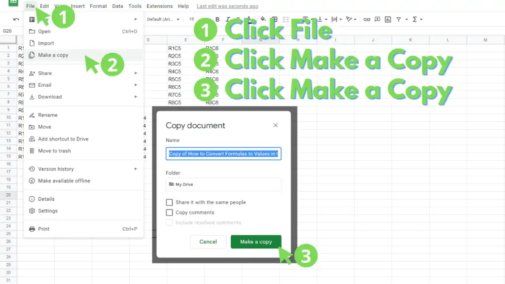
You can make a copy of the file by accessing it through this link, then by clicking on “File” from the Menu Bar, then by clicking on “Make a copy”.
A dialog box should appear. Within it, you can provide a filename for the Copy then click “Make a Copy”
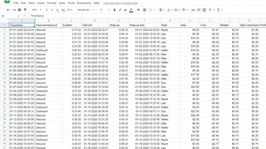
The “rawData” worksheet is a sample database of calls made in a typical call center. These data points are randomly generated.
Next, the “pivotTables” worksheet contains Pivot Tables derived from the “rawData” worksheet.
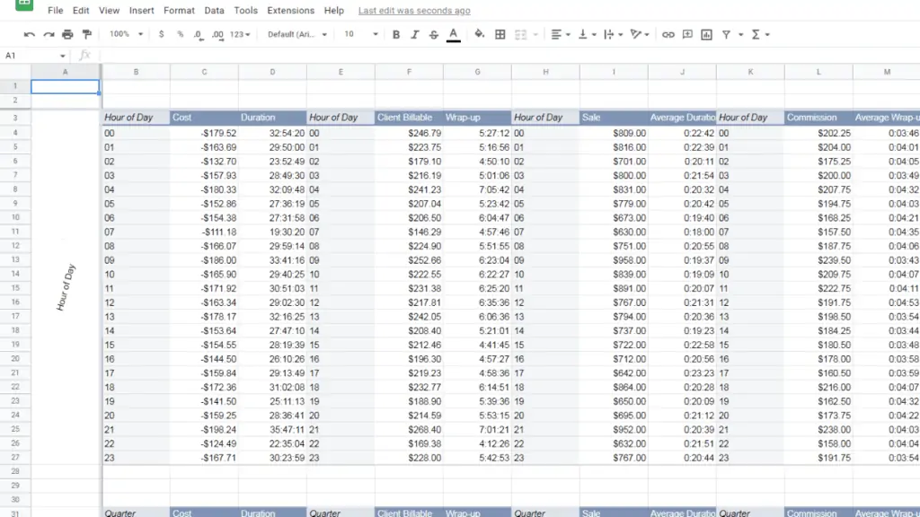
They are grouped by how the data points are drilled down: by hour of say and quarter.
The columns comprise the sums, averages, and counts of several values.
You may notice that there are repeated columns within each group.
This is by design to simulate how Google Sheets disambiguates and consolidates each of them by their column headers.
The “charts” worksheet contains visualizations of a group of data from the “pivotTables” worksheet. They are essentially a collection of Pivot Charts.
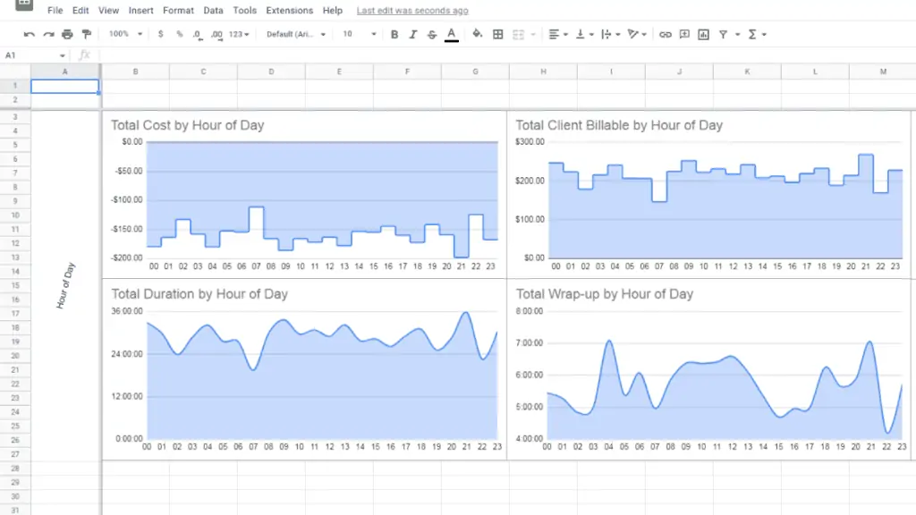
There are multiple charts for each group, and each of them is a practical application of pivot charts.
The use of numerous charts is by design, to present a contrast between the use of numerous charts versus combining these charts through a combo chart.
Finally, you have the “comboCharts” worksheet. This worksheet is partially filled for you and will serve as a guide.
Each combo chart is a combination of a group of pivot charts from the “chart” worksheet.
Through this Tutorial, you will create a combo chart that combines several charts from the “charts” worksheet, under the Quarter group.
Step 1 – Identify which charts you want to combine using a combo chart
In this step, we will identify which charts we want to combine.
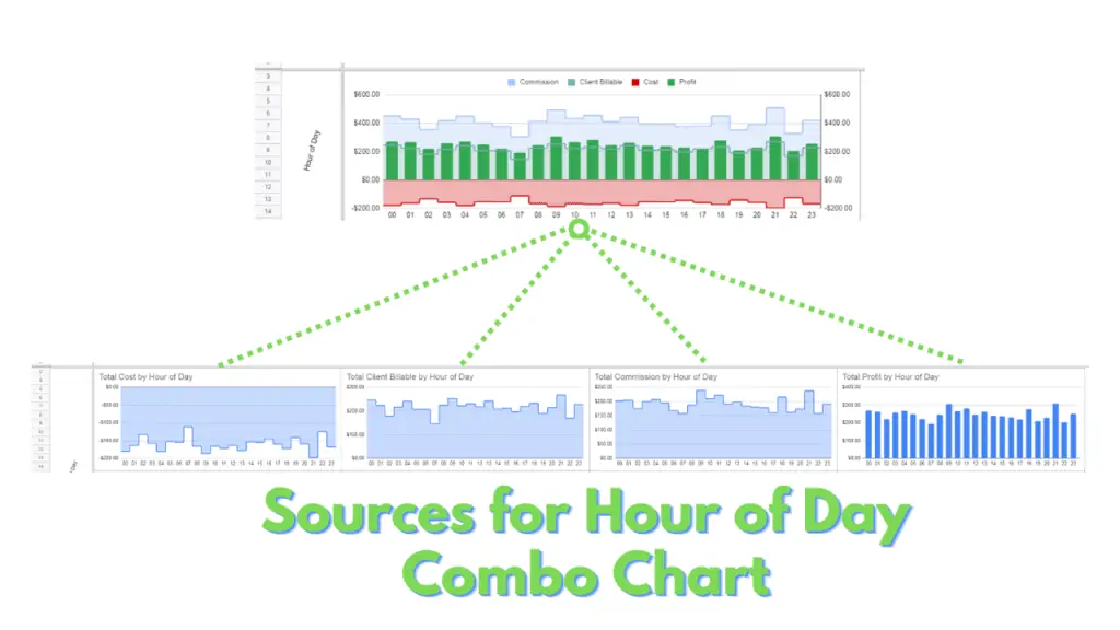
Using the example provided on the Hour of Day grouping on the “comboChart” worksheet, you can identify that the combo chart is a combination of the commission, client billable, cost, and profit charts from the “Hour of Day” group of the “charts” worksheet.
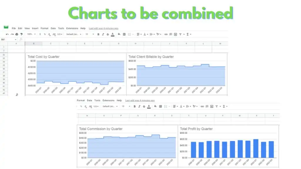
Replicating this, you can now identify the charts you need to identify to create the combo chart for the “Quarter” group.
For the combo chart of the “Quarter” group, these are the Commission, Client Billable, Cost, and Profit charts from the “Quarter” group of the “charts” worksheet.
Step 2 – Identify the source of values of the charts you want to combine using a combo chart
Using the information from the previous step, we can now identify which ranges we will need to create combo charts.
For the combo chart you will create, the values needed are commission, client billable, cost, and profit. These can be found under the respective columns of L, F, C, O, down rows 32 to 42 of the “charts” worksheet. While the Row Header can be found in the B32:B42 range of the “charts” worksheet.
Another approach to identifying the source is by opening the chart editor. To do this, click on the kebab button then switch to the Setup tab. You can extract the source range in the field under the data range section.
Step 3 – Select the ranges for the values and Insert a combo chart
The next step involves selecting the ranges on the “pivotTables” worksheet through CTRL+Dragging.
To select the Ranges for the combo chart, hold down the CTRL button while clicking and dragging your left mouse button through the ranges B32:B42 (Row Header), L32:L42 (Commission), F32:F42 (Client Billable), C32:C42 (Cost), and O32:O42 (Profit).
Next, click on “Insert” from the Menu Bar, then click on “Chart”. This should generate a default Column Chart.
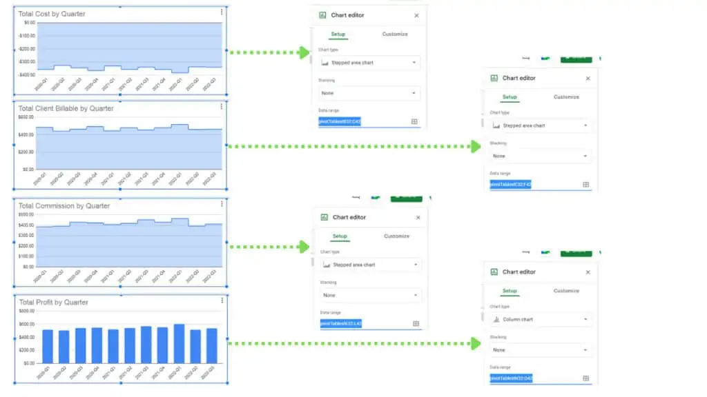
To switch the chart type to a combo chart, edit the chart by clicking on the kebab button, this will reveal the Chart Editor Panel. In the Chart Editor Panel click on the drop-down under the Chart Type section, then select combo chart from the options.
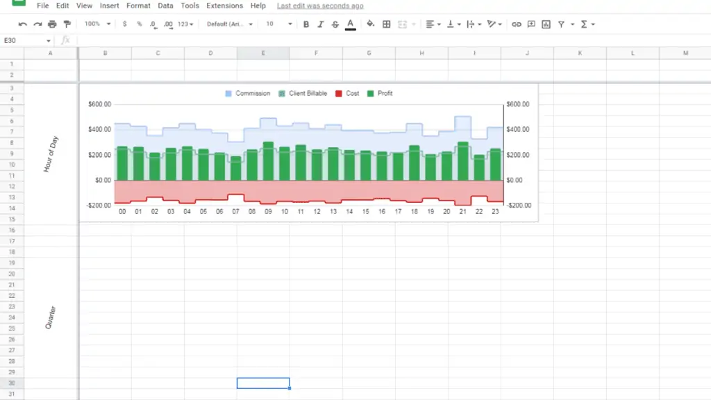
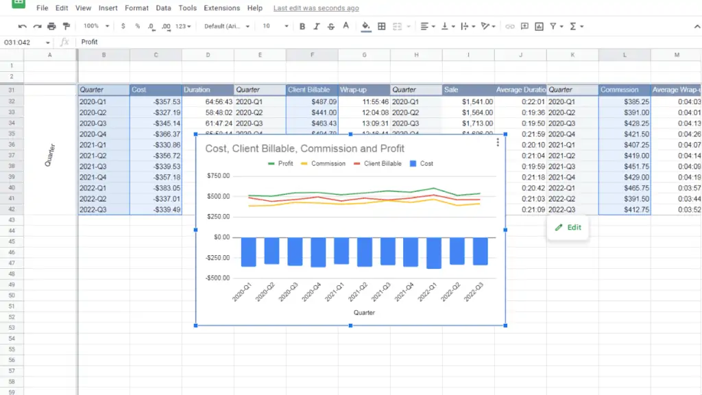
You should end up with a combo chart like this:
Step 4 – Select the Standard Stacking option
Once created, you may notice that the combo chart pertains to interconnected financial data.
The Profit data is technically the sum of Commission, Client Billable, and Cost Data. To better represent this relationship between your values, you can use a Standard Stacking Option.
To do this, open the Chart editor panel and select “Standard” from the drop-down selection under the Stacking section.
You should end up with a chart like this:
Step 5 – Select the Graph type for the Series in your combo chart
Next, we will switch each individual Series in your combo chart to use a “Stepped area” graph.
To do this, open the Chart editor panel and switch to the Customize tab. Once there, expand the Series section and select “Stepped area” on the drop-down under the “Type” section.
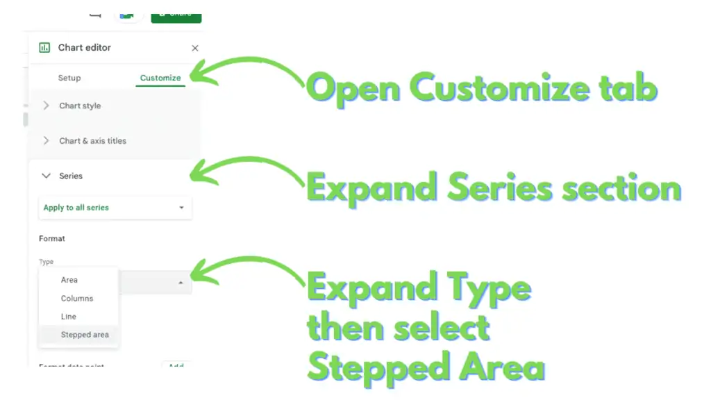
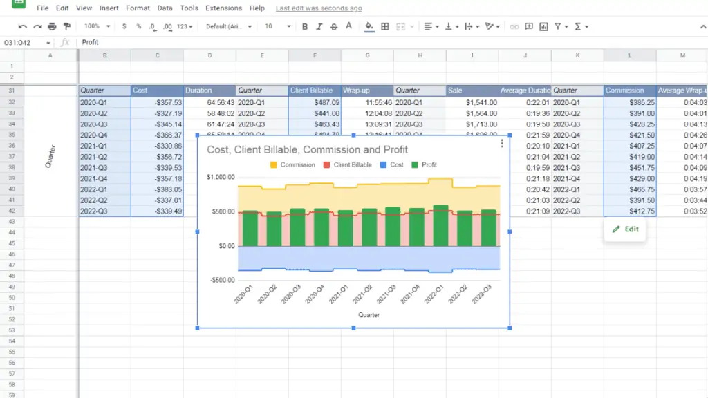
Following this, we will switch the Profit Series to Column Graph. To do so, select Profit from the drop-down directly under the Series label. Next, select “Column” under the “Type” section.
You should end up with a chart like this:
Step 6 – Select the Axis for the Series in your combo chart
You may notice that the Data in the combo chart are all grouped together, regardless of their relationship with each other.
From what we’ve discussed, we know that Profit is the sum of Commission, Client Billable, and Cost. Thus, Profit should not be included in a stack with the rest of the three.
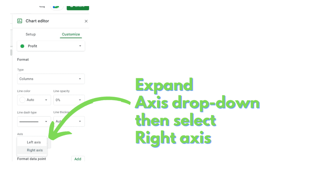
To separate it, you have to switch which axis it is connected to. To do so, open the Chart editor panel and switch to the Customize tab. Once there, expand the Series section and select Profit from the drop-down directly under the Series label.
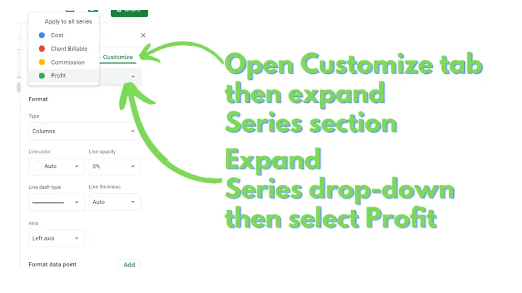
Once Profit Series is selected, select “Right axis” in the drop-down under the Axis section.
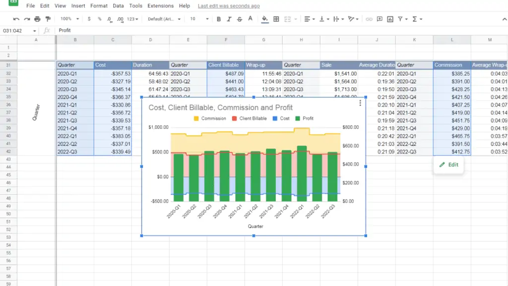
You should end up with a chart like this:
Step 7 – Match the Min and Max values of the vertical axes
If you compare the Left vertical axis with the Right vertical axis, their minimum and maximum values are not the same.
Unless specified, Google Sheets will provide these values depending on the minimum and maximum values for all the Series linked with their respective axes.
As a result, the graphs that represent the Series of each axis do not visually represent their values, relative to one another. Therefore, to provide a more accurate visual representation, you need to match the Min and Max values for both axes.
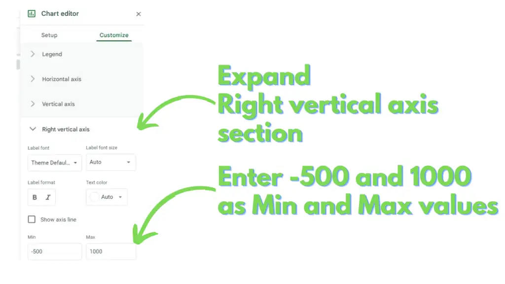
While it is possible to specify the values (min and max) for both axes, doing so for the Right vertical axis will suffice for our example.
Access the Chart editor and switch to the Customize tab. Expand the Right vertical axis section and enter -500 and 1000 under the Min and Max fields, respectively.
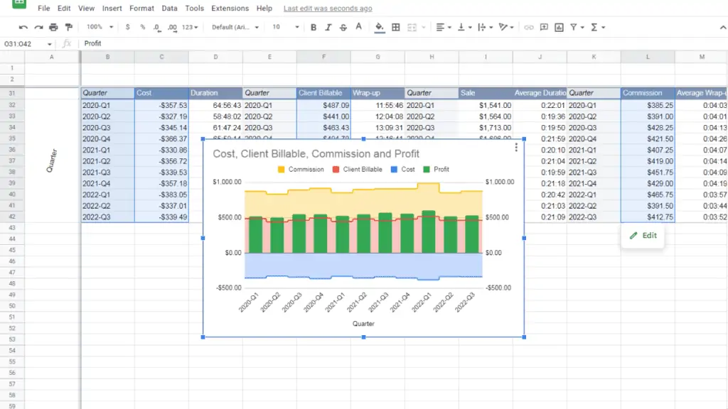
You now know How to Combine Charts in Google Sheets. Your final combo chart should look like this:
Frequently Asked Questions On How to Combine Charts in Google Sheets
Is there a way to specify which Series combination will stack with each other in Google Sheets?
A series will only stack with another series if they are linked to the same axis and are of the same Graph type. And finally, stacking will only work for Stepped Area or Column Graph types. This gives you a maximum of 4 stacks, Stepped Area and Column for both the left and right axes.
Can I combine the horizontal Bar Chart with other horizontally aligned charts in Google Sheets?
As of writing, Google Sheets can only support the combination of charts with a vertical profile (Column, Area, Stepped Area, Line).
Conclusion on How to Combine Charts in Google Sheets
To Combine Charts in Google Sheets need to identify which charts you will combine. Ideally, these charts share the same units like whole numbers, durations, money amounts, etc.
Identify the source of the values you want to combine by accessing the Data range field of the chart, which can be found in the Setup tab of the Chart Editor. You can access the Chart editor by selecting the chart and by clicking the kebab button (3 vertical dots) in the upper-right corner of the chart.
Select the ranges for your combo chart. If the ranges are non-contiguous, you can pick separate ranges for a single selection by holding CTRL and clicking or click-dragging the ranges you need.
Use the Standard Stacking option for your combo chart by accessing the Chart editor panel. The panel can be opened by selecting the chart, then by clicking on the kebab button (stacked dots) on the chart’s upper-right corner, then by clicking “Edit chart”. In the Chart editor panel’s Setup tab, select “Standard” in the drop-down below the Stacking section.
Switch the Graph types for each of your combo chart’s Series, enter the Customize tab of the Chart editor. Expand the Series section then choose which Series you want to change on the drop-down. Once you have selected a Series, change its Graph type by selecting one of the options in the drop-down under the Type section.
You can also switch which axis a Series will associate itself with by choosing Left axis or Right axis in the drop-down under the Axis section.
Finally, you can match the Min and Max values for your axes. To do this, access the Chart editor, and switch to the Customize tab.
Once in the Customize tab, expand either the Vertical axis or Right vertical axis sections.
For both sections, there are fields labeled Min and Max. You can enter your desired Min and Max values for either or both of the axes.