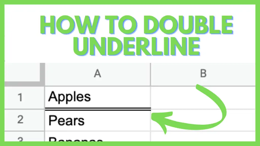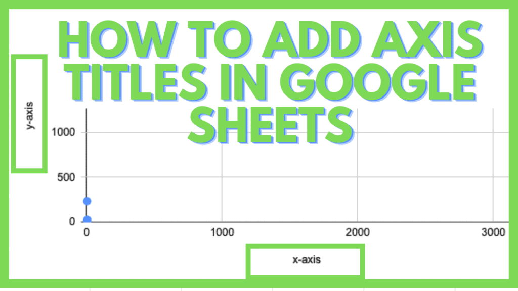
In this tutorial, I am going to show you how to add axis titles in Google Sheets.
Charts and graphs are helpful to display and analyze data. Different types of charts in Google Sheets can be used to understand the nature (trend) of a data set.
Axis titles are one of the things you can do to improve the readability of your charts. Adding or changing axis titles is simple and in this tutorial, I am going to show you how it is done:
How to Add Axis Titles in Google Sheets
Axis Titles in Google Sheets can be added using the Chart Editor. To add axis titles in Google Sheets do the following:
- Enter data values in Google Sheets
- Select the data by highlighting it
- Click on insert chart
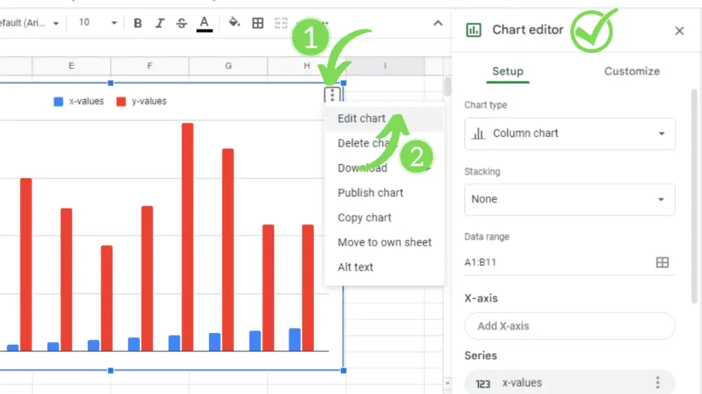
- Click on the three dots on the upper right-hand side of the chart
- Click on “Edit chart”
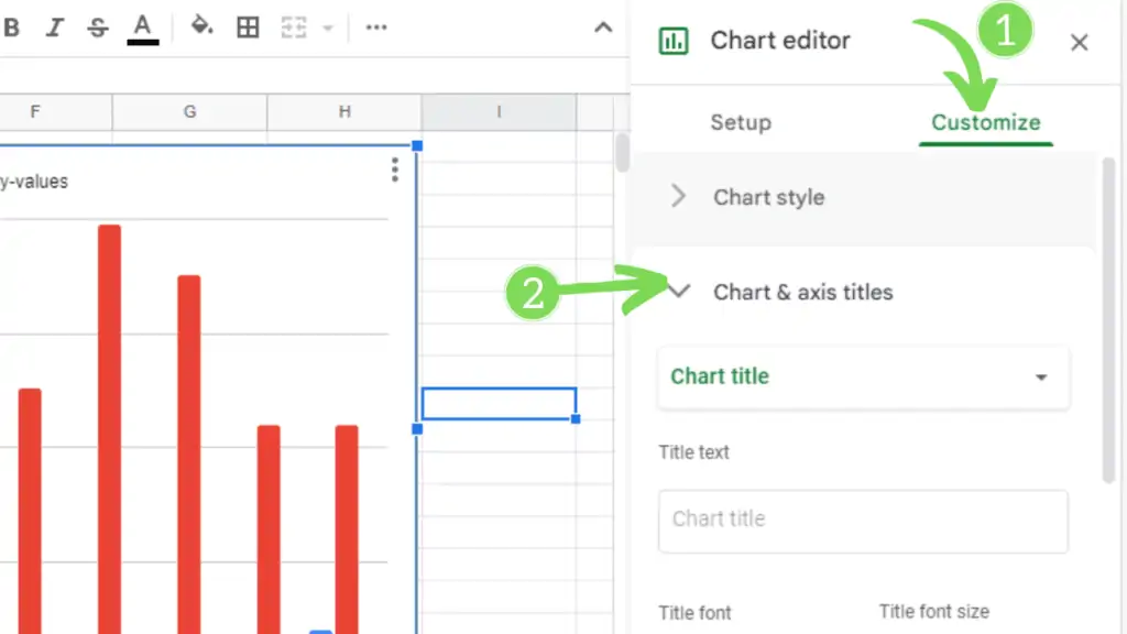
- In the Chart Editor click on “Customize”
- Then open up “Chart& axis titles”
- Change between “Horizontal axis title” and “Vertical axis title”
- Enter the axis titles in “Title text”
- The axis titles are now visible in your chart
Adding Axis Titles in Google Sheets Video Tutorial (Step-By-Step)
How to Create A Chart in Google Sheets
As I mentioned earlier, you need to have some sort of dataset in your Google Sheet to create a chart from it.
For the sake of this article, let’s say, I have the following data in my Google Sheet:
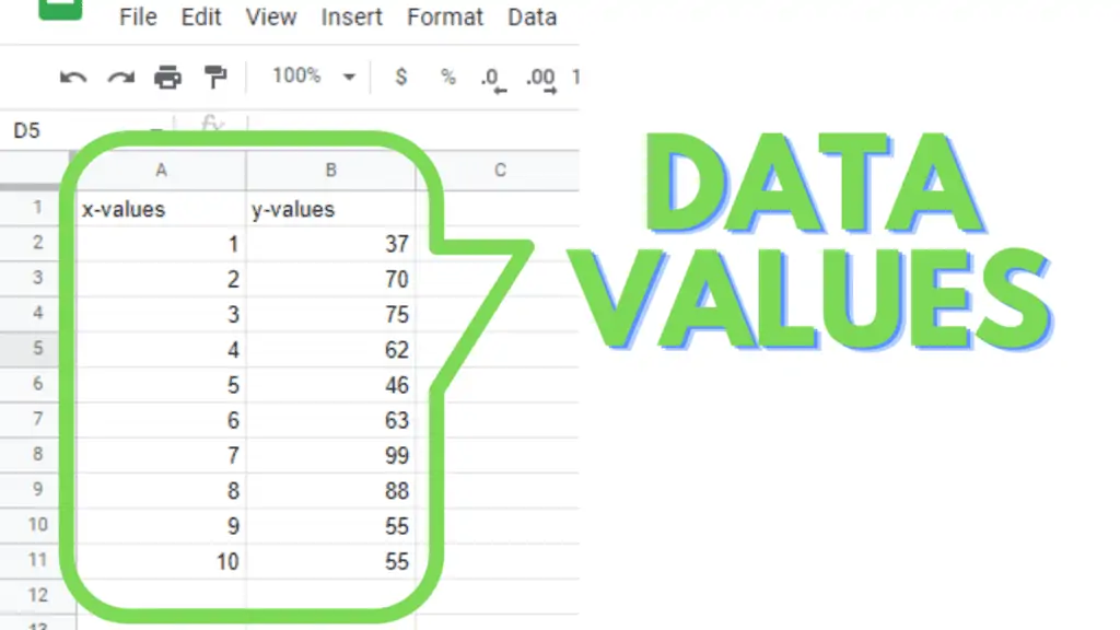
As you can see in this screenshot, I am using simple data with two columns that are for the x-axis and y-axis respectively.
And now, I want to create a very basic simple column chart using this data where the values in the column named x-values will be the data values for the x-axis and the values in the column named y-values will be the data values for the y-axis.
There are two ways of creating a Column Chart from this dataset.
Method 1 – Insert a Chart and then Select Data for the Chart in Google Sheets
In this method, first, we will insert a chart into our Google Sheet and then edit the chart and select the data for it. Following are the needed steps:
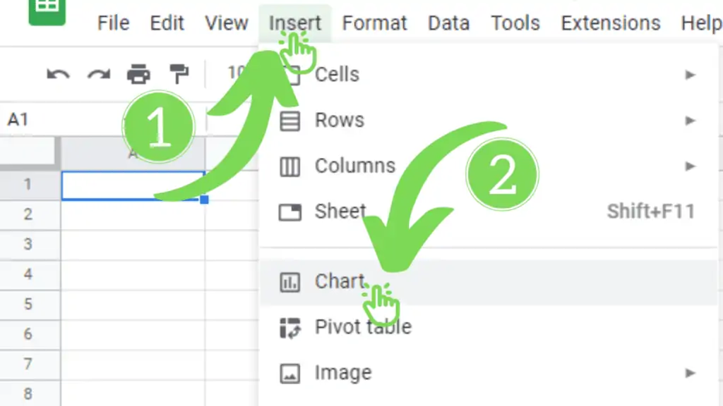
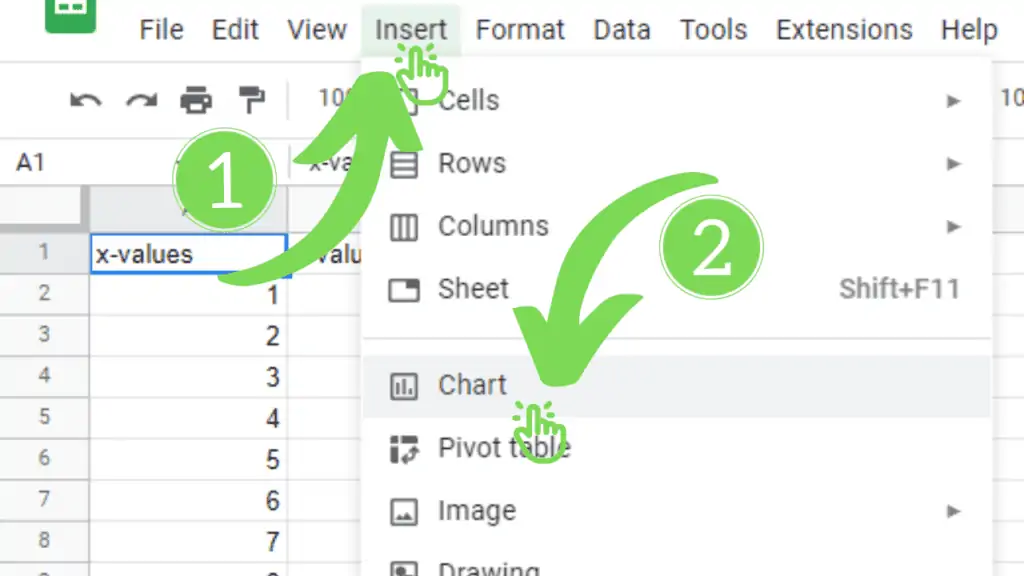
Step 1 – Insert a Chart into the Google Sheet
Go to the insert tab of your Google Sheet and click on chart:
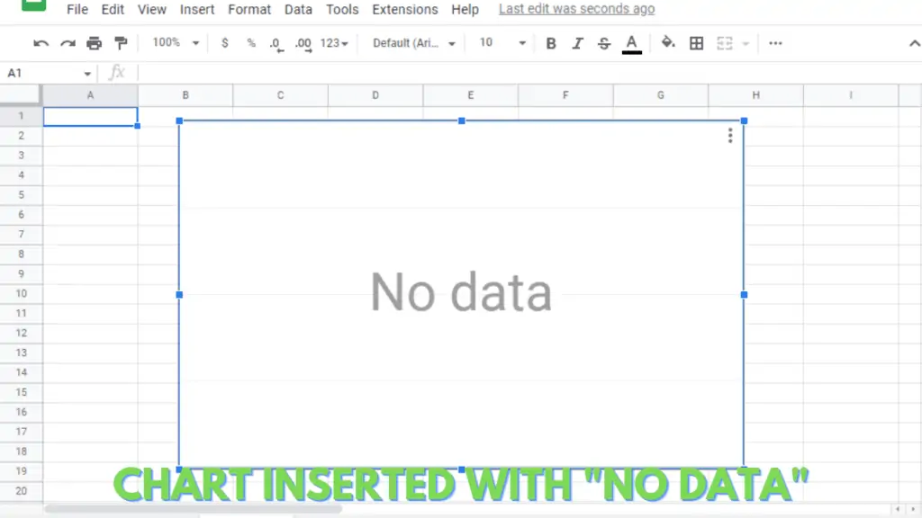
A simple chart will be inserted with no data:
Step 2 – Select Data for the Inserted Chart in Google Sheets
Now, as we have added a chart to our Google Sheet, we need to select data for our chart.
For this, I’m going to copy my previous data into this current sheet and select it for my inserted chart.
Here are the steps to select the desired data for the chart:
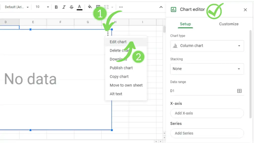
1. Open the Chart Editor pan
This pan can be opened by:
a.) Double-clicking on the chart
b.) Click on the menu button on the top-right of the chart and click “edit chart”:
2. Select the data range for the chart
In the heading “Data range” click in the box below to type the range of your dataset (e.g., in my case, data range is A1:B11) OR click on the small boxes (on the right side) to see and select from the suggested data ranges.
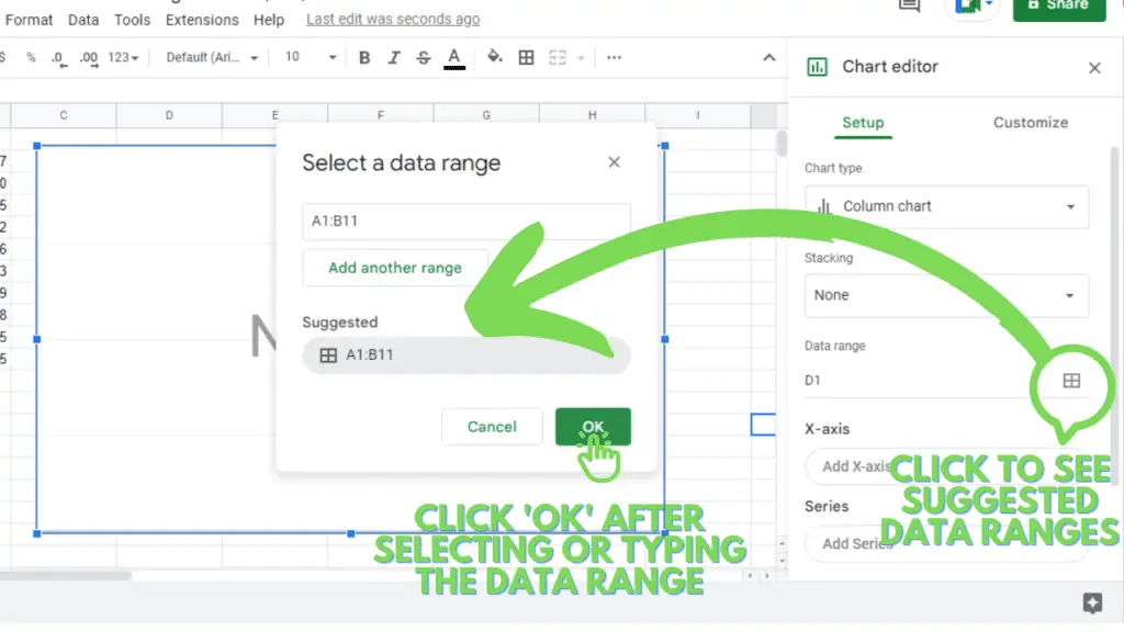
Select or type in the desired data range and click OK.
3. The values will be represented in the chart area
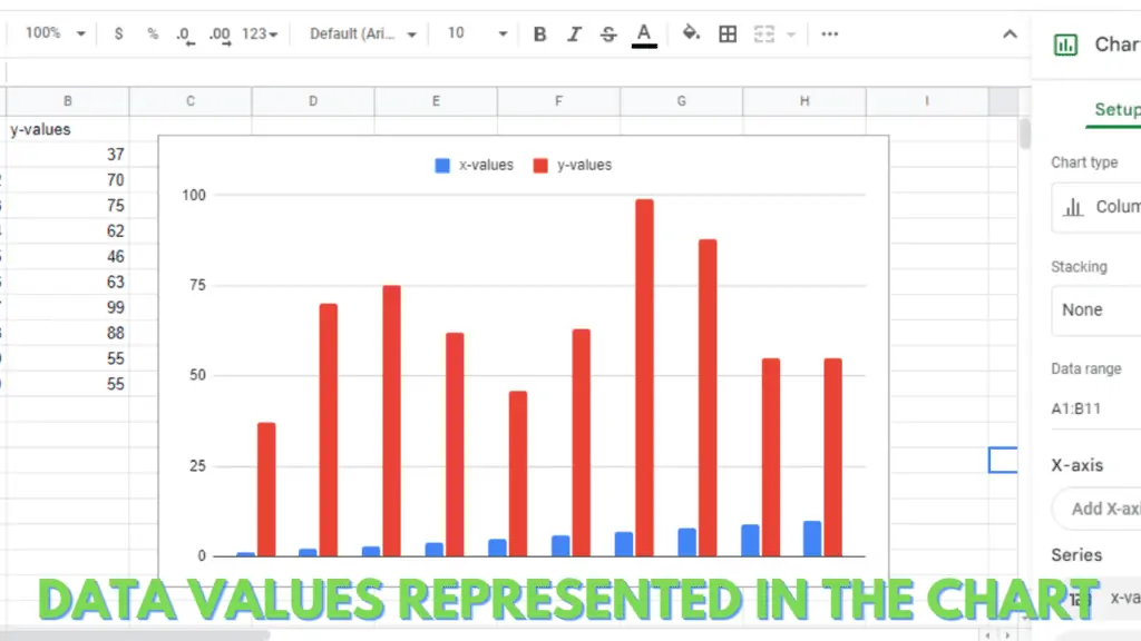
This is the basic procedure of selecting the data range for the inserted empty chart.
We can further customize the data range selected, to see the results as per our requirements.
Google Sheets automatically adds x & y values as a series for the column chart and no values for the x-axis.
Method 2 – Insert a Chart While Keeping the Active Cell in the Dataset
Using the second method, Google Sheets will automatically sense the data range and display the data values on the inserted chart.
You will have to keep the active cell in your data set range or its neighborhood column or row.
Step 1 – Click anywhere in the dataset
Step 2 – Insert the chart
Go to the insert tab of your Google Sheet and click on chart:
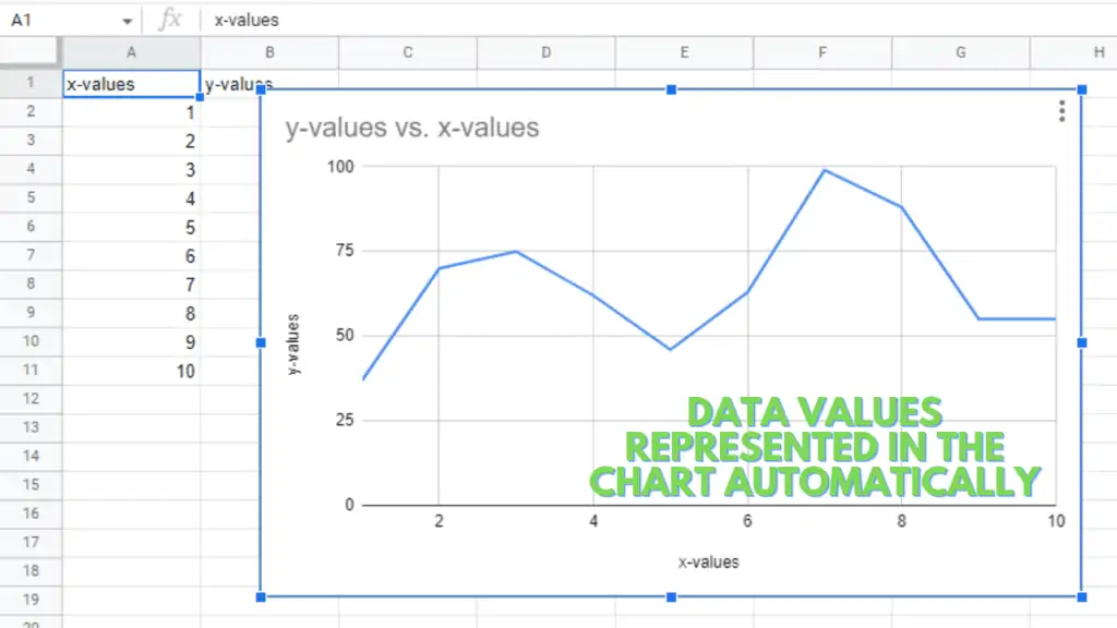
Step 3 – A chart will be inserted
A chart will be inserted automatically showing the data values. Google Sheets automatically inserts the line chart.
Adding Chart Axis Titles in Google Sheets
After the successful insertion of our chart in Google Sheets, it’s time to add/edit the chart axis titles.
Now, here in my case, as you can see in the chart inserted using Method 1, there are no chart axis titles at all, while in the chart inserted using Method 2, the axis titles are automatically added.
So, I am going to use Method 1 to teach you how to add the chart axis and also edit them. Here are the steps:
Step 1 – Open Chart Editor Pan
This pan can be opened by:
a.) Double-clicking on the chart
b.) Click on the menu button on the top-right of the chart and click “edit chart”:
Step 2 – Open Chart & Axis Titles Section
Click on the “Customize tab” in the Chart editor pan
Click on (open) the “Chart & axis titles” section
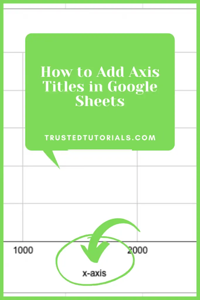
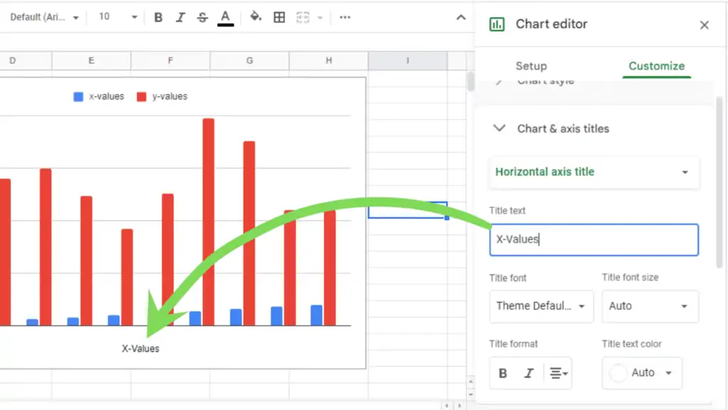
Step 3 – Edit Horizontal Axis Title
Click on the Dropdown named Chart title and select the option “Horizontal Axis Title”
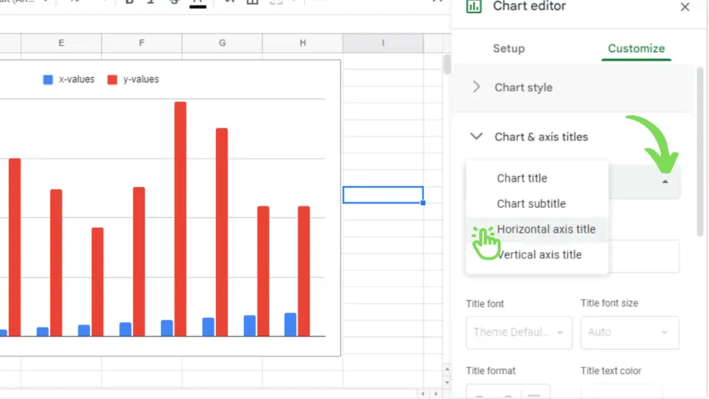
The options to customize the horizontal axis (x-axis) title will appear.
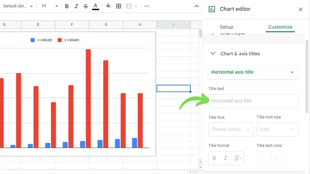
Type the Horizontal axis title of your choice (I’m going to type “X-Values”). It will appear on the chart.
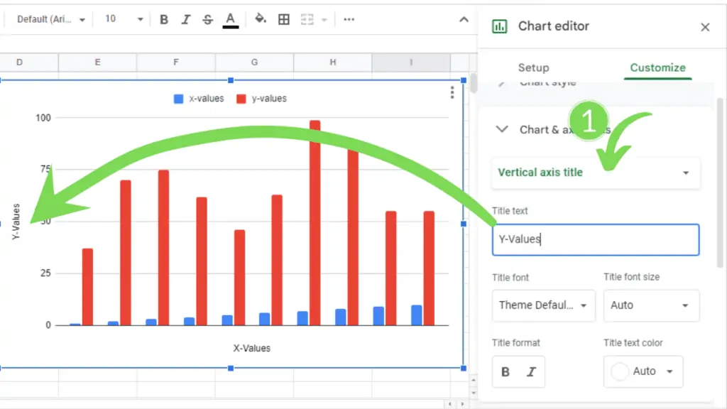
Same procedure for the vertical axis (y-axis) title (I’m going to type “Y-Values”).
Conclusion On How to Add Axis Titles in Google Sheets
To add axis titles in Google Sheets click the three dots on the right-hand side of the chart. Click on “Edit chart”. Then in the “Chart editor” click on “Customize”. Go to the section “Chart& axis titles”. Change between “Horizontal axis title” and “Vertical axis title”. Enter the axis titles in “Title text”.