In this tutorial, I will show you how to create a bar graph in Google Sheets.
Charts and graphs in Google Sheets are one of the best ways to visualize your data. That said, it may appear to be something so simple to do and it is, but there are also other types of graphs other than the most basic ones.
The bar graph belongs to this group. More often than not, column graphs are used as well as the most basic bar graph to represent one or two sets of data.
Create a Bar Graph in Google Sheets
- Prepare your data range and select it
- Click on the ‘Insert chart’ tool on the toolbar
- On the chart editor window, change the chart type to a bar chart
- Modify your bar graph in Google Sheets as per your preference

Create a Bar Graph Video Tutorial
Creating a Bar Chart in Google Sheets
It’s easy to create a bar chart in Google Sheets.
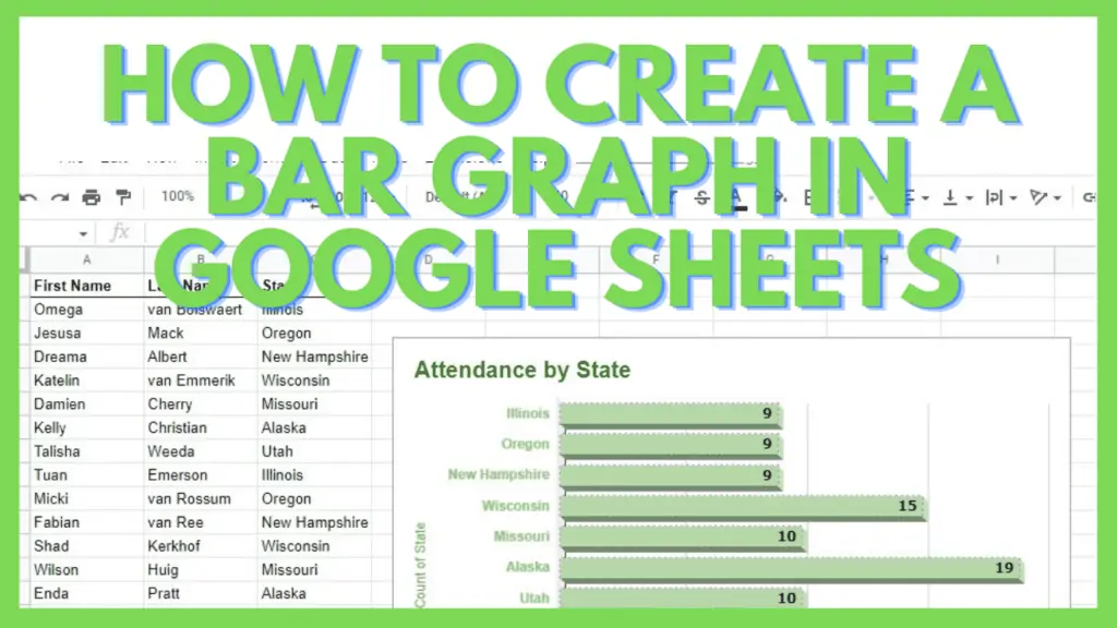
To start, you have to have a data set or table that you’ll use as the data source of your graph. This is applicable to all types of charts and graphs.
Select your table or data set.

Next, go to ‘Insert’ and select ‘Chart’.

A default chart will appear depending on the data that you have. This default one is automatically suggested by Google Sheets as it thinks it is the best chart or graph for the data that you have selected.
Don’t worry though as along the chart, the ‘Chart editor’ also appears on the right side of your screen. Here, I can just easily go to the ‘Chart type’ field and change it to a bar graph.

In the menu that follows, just scroll down until you get to the ‘Bar’ section of the choices. Select one of the three choices of a bar chart.

After clicking on an option, your chart will automatically change into your selected bar graph option.

Other than the method of going through the Insert menu and selecting the Chart option, you may also use the shortcut for inserting charts.
Look for a small square icon with three short lines which is the third button from the right (by default). I’ve added the image of the ‘Insert chart’ tool below as seen on the toolbar.

This is how you create a bar graph in Google Sheets.
3 Types of Bar Graphs in Google Sheets
As always, the most important part of any graph is its data.
For the following examples, I will be using the same table so I can clearly show the difference of each example reflected with the same data set.

There are three basic types of bar graphs in Google Sheets.
1. The Regular Bar Graph in Google Sheets
The most basic of all bar graphs is the default bar chart.
This is best used to compare individual items where the data set has one or two points of comparison.
Below is the basic bar graph with the above sample data range used.

If you want to modify the basic bar graph in Google Sheets, you just need to use the ‘Chart editor’.
If it disappears, just double-click on your chart or click on the vertical ellipsis on the upper-right corner of your chart, and then select ‘Edit graph’.
In the example below, I ticked switched rows and columns as well as the Maximize and 3D settings causing the differences in the appearance of the bar graph below versus the earlier one.

2. The Stacked Bar Graph in Google Sheets
The next one is the stacked bar graph in Google Sheets.
This is best used to show part-to-whole relationships and potentially find trends in data over a set period of time.
Below is the stacked bar graph with the above sample data range used.

I edited the stacked bar graph to switch its rows and columns as well as turned on the 3D settings to make it look better.

3. The 100% Stacked Bar Graph in Google Sheets
The last bar graph in Google Sheets for this tutorial is the 100% stacked bar graph.
This is best used when you want to show the relationship among individual objects in your data set and the whole in a single bar, and the cumulative total is not significant.
Below is the 100% stacked bar graph with the above sample data range used.

I updated the settings of the 100% stacked bar chart to switch its rows and column as well as to turn on its Maximize setting.

Using charts such as the bar graph in Google Sheets has a lot of power in terms of giving you the ability to visualize your data.
Just like with Pie Charts and Line Graphs, knowing how to use a Bar Graph in Google Sheets can help you a lot in presentations and reports.
Frequently Asked Questions about How to Create a Bar Graph in Google Sheets
How can I insert a bar graph in Google Sheets?
To insert a bar graph in Google Sheets, select your data range, and then you may either click on the Insert chart tool in the toolbar or go to the Insert menu and select the Chart option. Change the default chart to a bar graph in the chart editor window.
How can I modify a bar graph in Google Sheets?
You can modify a bar graph in Google Sheets by changing the different settings available in the Chart Editor window. To use the chart editor, you can double-click on a graph or click on the vertical ellipsis in the upper-right corner of the graph, and select ‘Edit chart’.
Conclusion on How to Create a Bar Graph in Google Sheets
You can create a bar graph in Google Sheets by first preparing your data range and selecting it. Next, click on the ‘Insert chart’ tool on the toolbar. On the chart editor window, change the chart type to a bar chart. Lastly, modify your bar graph in Google Sheets as per your preference.