In this tutorial, I will show you how to add a trendline in Google Sheets.
One of the best perks of using Google Sheets is its ability to give you a way to present your data in a much more meaningful manner than simple tables and databases.
Utilizing charts and graphs to visualize data is an effective way to demonstrate the relationships between the variables in your data.
Additionally, when you add a trendline in Google Sheets, also called the line of best fit, to a scatter chart, you can get a better interpretation of your data.
That said, I understand that adding a trendline is not as known as the common charts.
How to Add a Trendline in Google Sheets
- Select your data range
- Go to Insert and select Chart
- Change the chart type to Scatter chart, if necessary
- Under Customize, go to Series
- Tick the Trendline checkbox

2 Methods to Add a Trendline in Google Sheets
There are two different ways to add a trendline in Google Sheets.
First is by editing the Series option of a Scatter Chart. The other is by using the TREND Function and creating a Line Chart with its data.
1. Scatter Chart Series Customization
For starters, I have a data range containing the data that I’ll make a scatter chart out of.
To begin I’ll have to select my data range.

Next, go to the Insert menu and select the Chart option.

This will instantly add a scatter chart if Google Sheets deems your data best fits into it. Otherwise, you can simply change the chart type via the chart editor.

To begin adding a trendline in Google Sheets, go to the Customize tab of the Chart editor.

Next, open the Series option menu.

Scroll down below and you’ll see three checkboxes with the Trendline as the last option. Tick its respective checkbox.

This will now cause your Scatter Chart to have a trendline in Google Sheets
2. Line Chart with the TREND Function
Another method of adding a trendline in Google Sheets is by using the TREND Function. If you have partial data with a known linear trend, this function fits an ideal linear trend using the least squares method and/or predicts additional values.
The syntax of TREND is
=TREND(known_data_y, [known_data_x], [new_data_x], [b])
I’ve used TREND in the example below.
TT_59_7

To add a trendline in Google Sheets with this data, select the whole data range. Then go to the Insert menu and select the Chart option.

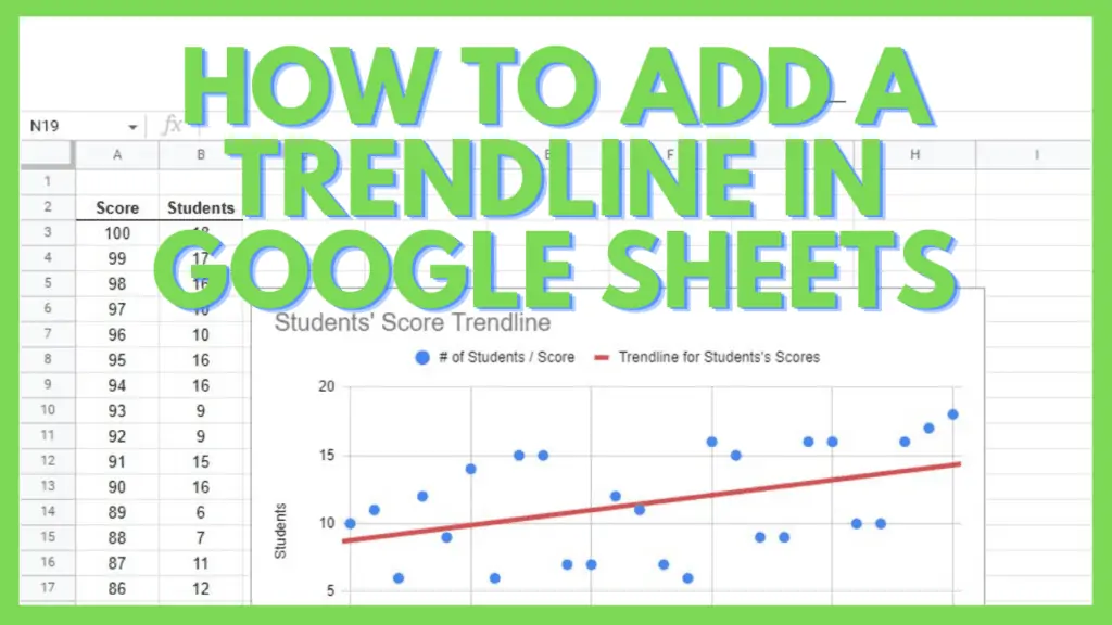
This will add a line chart where, as seen in my example below, shows two lines with the trendline in Google Sheets appearing as the red line.

If you take a look at both charts at the same time, you’ll notice that the trendline in Google Sheets for both tables appears the same even with different charts.
Customizing the Trendline
Like other charts and graphs, you can also customize the trendline in Google Sheets for both scatter charts and line charts.
To edit the trendline for scatter charts, open the Chart editor and go to Series.

Just below where you tick the checkbox for the trendline in Google Sheets, you’ll see the options to edit its appearance.

For Line Charts, you can also edit a trendline in Google Sheets by going to the Chart editor and then Series.

You will immediately see the format options for a trendline in Google Sheets. You can change the color, opacity, thickness among many others.

Using a trendline in Google Sheets can be extremely helpful for trend interpretation and prediction. Other than a trendline, you can also use bar graphs and pie charts to demonstrate and visualize your data, depending on your needs.
Frequently Asked Questions about How to Add a Trendline in Google Sheets
How can I add a trendline in Google Sheets?
To add a trendline in Google Sheets, you will need a data range that can be turned into a scatter chart. Once you have inserted a scatter chart into your sheet, customize its series property and enable the Trendline option.
How can I customize the trendline in Google Sheets?
To customize a trendline in Google Sheets, edit the chart or double-click on the trendline itself. For the former, under Customize, you may edit the Series section of the chart properties where you can change the color, opacity, and thickness of the trendline among others.
Conclusion on How to Add a Trendline in Google Sheets
You can add a trendline in Google Sheets by first, selecting your data range, going to the Insert Menu, and then selecting Chart. Next, change the chart type to a Scatter chart, if necessary. Lastly, under Customize, go to Series, and tick the Trendline checkbox.