Google Sheets also contains a plethora of impressive features to visualize data. This includes different options to present your data through tables, charts, or graphs.
One example of this is a line graph. In this tutorial, I’m going to explain how to make a line graph in Google Sheets.
How to Make a Line Graph in Google Sheets
- Select the range containing the data for a line graph
- Click on the ‘Insert chart’ button on the toolbar
- Edit the chart by using the ‘Chart editor’

Best Ways to Create a Line Graph In Google Sheets Video Tutorial
2 Methods to Make a Line Graph in Google Sheets
There are a number of benefits to using visual presentations such as line graphs.
They are easier to understand, perfect for comparing points in your data, and a great way for identifying trends and patterns found in huge sets of data over periods of time.
1. Using the Insert Chart Tool
For this to work, you must have a database that is suitable for a line graph. This means that at least one of the columns in your database must consist of values that are ordinal in nature.
Some of these ordinal values can be months, days, time, positional numbers, etc.
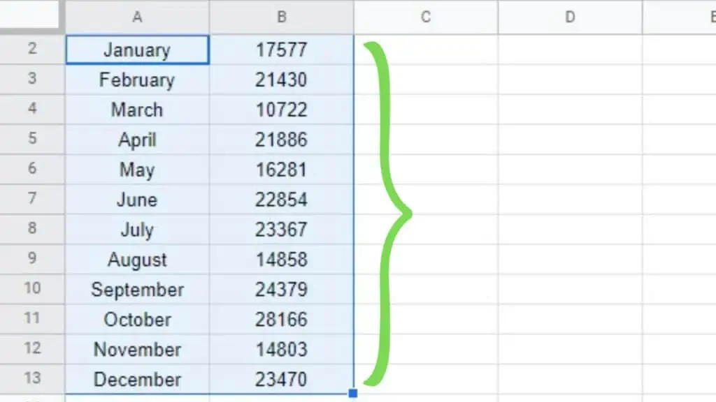
In the example below, I have a database with the months in the 1st column and the corresponding values in the 2nd column.
To start, I simply need to select the range with the data to be made into a graph in Google Sheets.
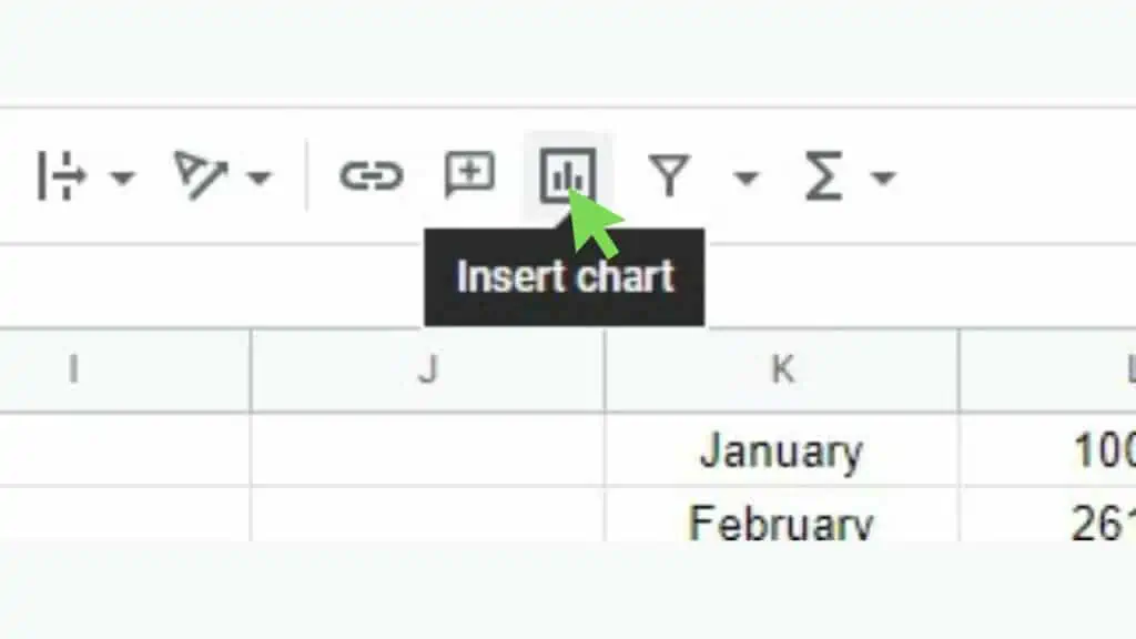
Next, click on the ‘Insert chart’ tool located on the Toolbar.
This will instantly create a line graph and will also show the ‘Chart editor’.
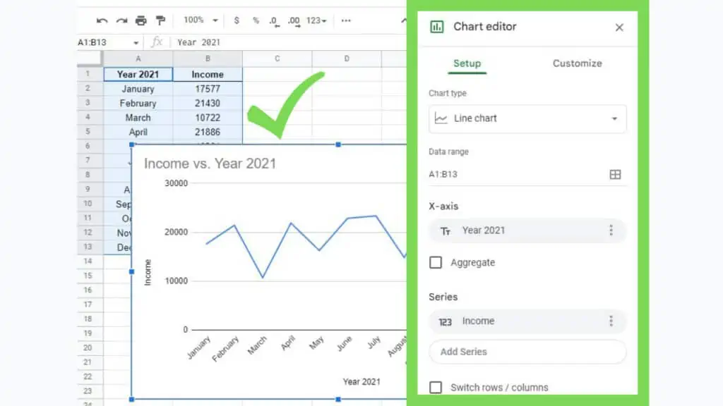
To edit the line graph, use the ‘Chart editor’. If it gets hidden (by clicking anywhere else), just click on the graph, then the vertical ellipsis on the upper-right corner, and select ‘Edit chart’.
Alternatively, I can just double-click on the graph itself.
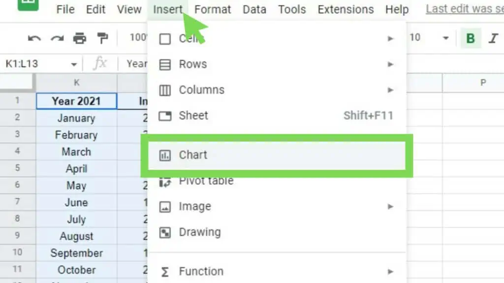
2. Using the Insert Menu
A different method to make a line graph in Google Sheets is to use the ‘Insert’ menu option.
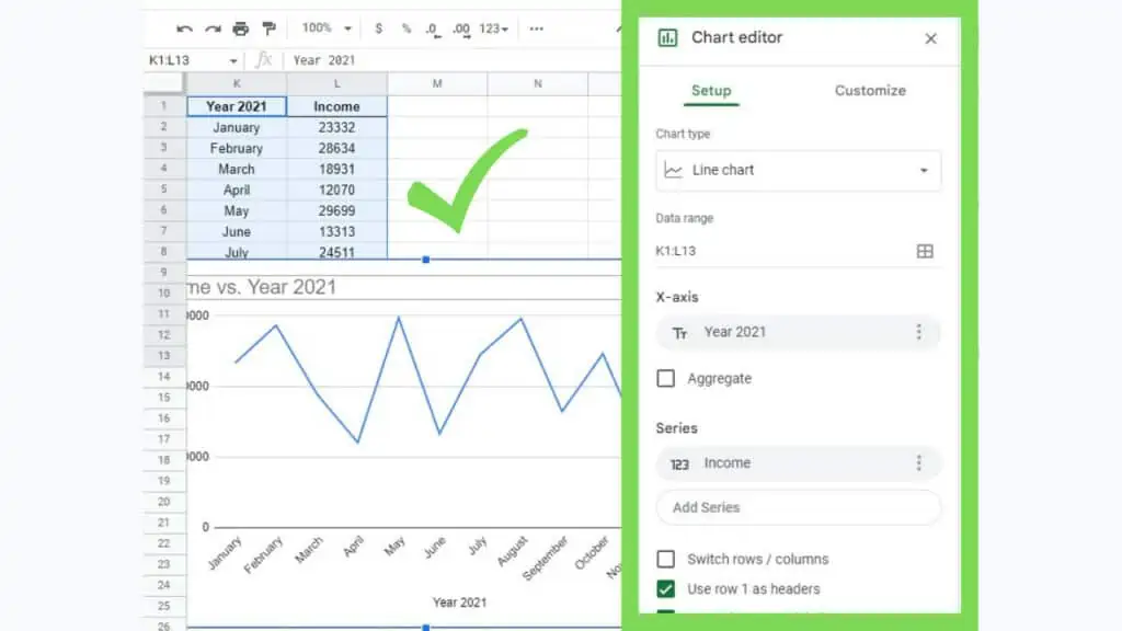
First, select the range containing the database. Then go to the ‘Insert’ menu, and select the ‘Chart’ option.
This will immediately produce the line graph (as long as your database has a column with ordinal values), along with the ‘Chart editor’ window.
The end result for both of these 2 methods are exactly the same. Depending on your preference, you may choose one or the other.
In some instances, the toolbar or some specific tool buttons may be hidden so in that case, it is important to know how to make a line graph in Google Sheets via the ‘Insert’ menu.
How to create a Line Graph in Google Sheets Examples
I’ve created the following examples below for you to see how the database tables look along with the line graphs in Google Sheets that were generated for each scenario.
1. Single Lines Line Graph in Google Sheets Example
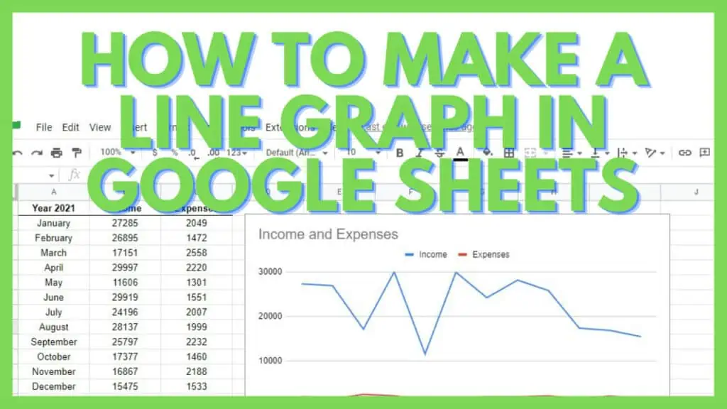
The database for this simply has one value being presented which is the ‘Income’ per month of the year 2021.
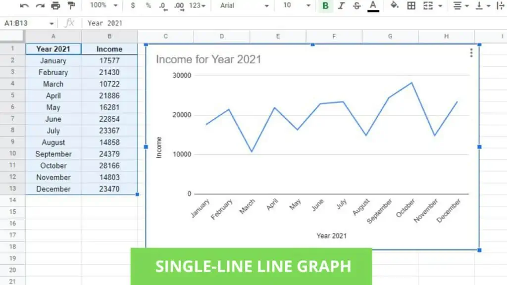
There only is a single line. This can be modified further depending on your needs and preferences.
2. Dual Lines Line Graph for Comparison in Google Sheets Example
In addition to the previous database, I now have ‘Expenses’ pitted against ‘Income’ in this line graph.
Using this design for a line graph in Google Sheets will allow you to directly compare one value versus another in the context of a month-per-month basis.
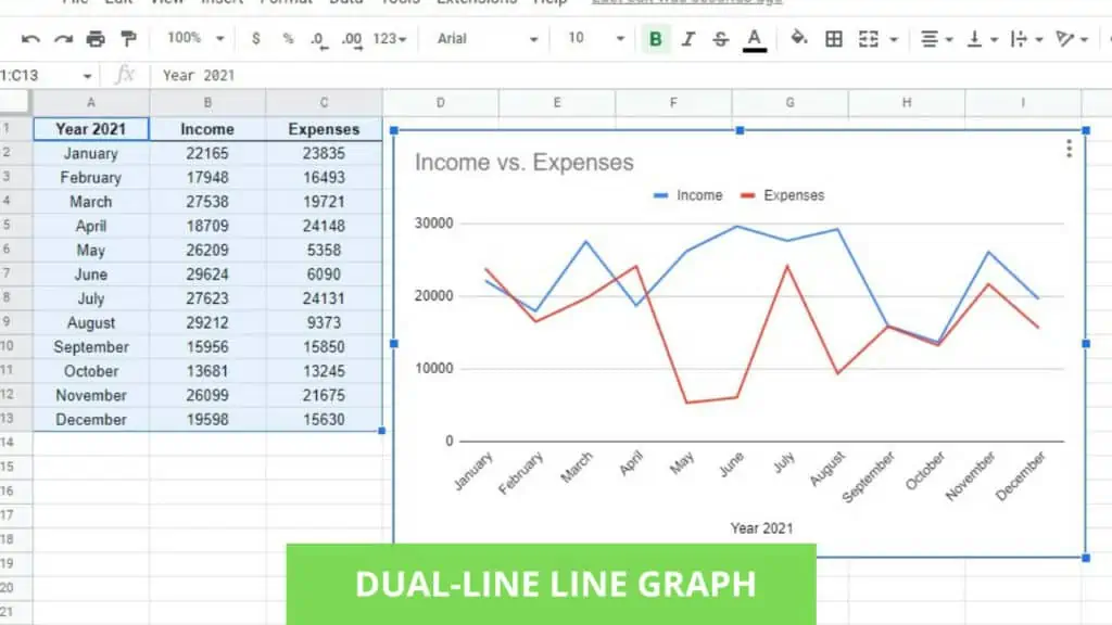
The colors for this graph were automatically generated and it really helps that they are in contrast with each other for better viewing.
For instances of a line graph in Google Sheets where there is more than one value being graphed, a legend will be automatically generated.
To further personalize this line graph, use the ‘Chart editor’.
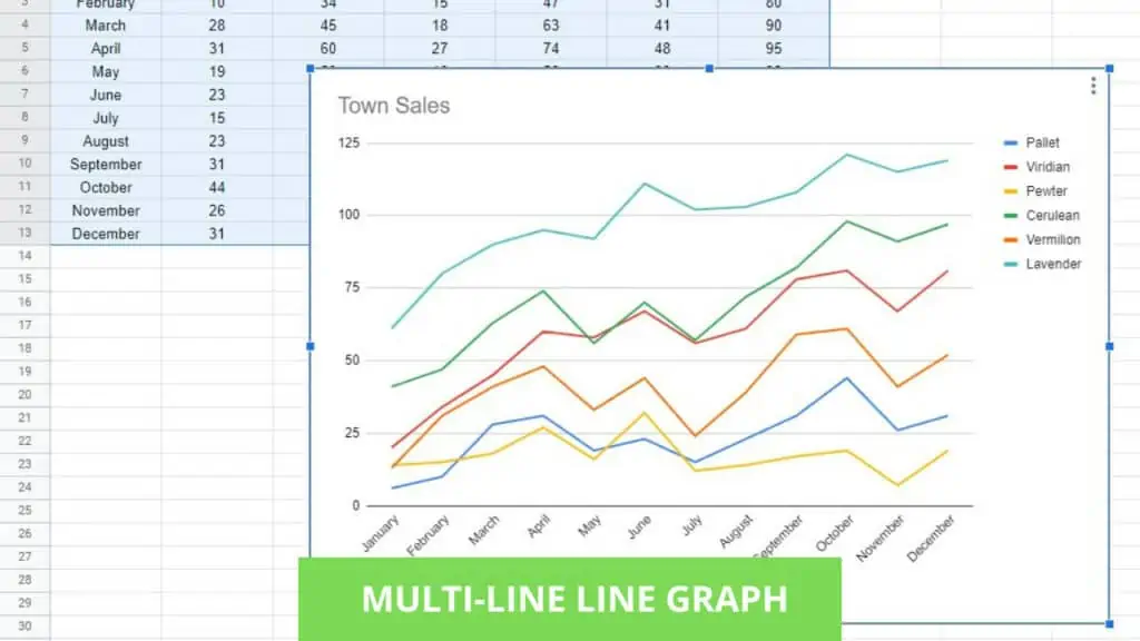
3. Multiple Lines Line Graph in Google Sheets Example
Multiple lines line graphs in Google Sheets are used to display multiple lines in one chart.
For the example below, I have the sales amount per month per town in a database.
Translated into a line graph in Google Sheets, it produced a legend defining each line’s color and corresponding value designation.
This graph is most useful for high-level overviews where you want to see the highest points, lowest points, and intersections for your values.
There are more ways to take advantage of charts and graphs such as using the Pie Chart in Google Sheets.
Frequently Asked Questions about How to Make a Line Graph in Google Sheets
How can I make a Line Graph in Google Sheets instead of a Pie Chart?
To make a Line Graph in Google Sheets, your data range selected must be well-suited to be for a line graph instead of a pie chart. Otherwise, you may try to modify your database to have “ordinal values” or change the ‘Chart type’ in the ‘Chart editor’.
Can I customize a Line Graph in Google Sheets?
You can customize a Line Graph in Google Sheets by using the ‘Chart editor’. In ‘Setup’, you may modify the contents of the graph while in ‘Customize’, you may edit its aesthetics, labeling, and more.
Conclusion on How to Make a Line Graph in Google Sheets
Make a Line Graph in Google Sheets by selecting the range with the data for your line graph. Then, click on the ‘Insert chart’ button on the toolbar. You may customize the chart by using the ‘Chart editor’ if required.